

My recent review of Karine Jean-Pierre’s book is now available to all readers — paywall removed! Enjoy.
Creative work always starts with a wager: you spend time, attention, and a piece of yourself with no promise that anyone else will notice or care, even you, really.
This post is a look at that wager in real time — what I tried, what failed, and why the failure turned out to be useful.
If you’ve ever wished you could see the messy middle instead of a polished reveal — or just looked at a piece of art you admired and wondered what went into making it — you’re in the right place.
Six months ago, I took what was, for me, an enormous creative risk.
I did an abstract portrait of someone — not my usual realistic portrait, but something layered in symbolism and metaphor — and gave it to the subject as a gift.
I wrote about it at length in a previous post, but the short version is that it didn’t matter at all. The recipient said nothing for weeks. When I finally pressed, the reply was a flat, “Oh yeah, I got it, thanks.”
I didn’t need him to love it. I needed it to matter.
If I’d understood the risk I was taking, I wouldn’t have taken it. If you’d asked me in advance how I’d respond to complete indifference, I probably couldn’t have answered. That possibility simply wouldn’t have occurred to me.
Ironically — given my life history, this may be the most ironic self-assessment I’ve ever made — I had too much self-esteem at the time to imagine that it could simply not register.
The thought never crossed my mind.
Me, the mistress of Worst Case Scenario management.
Since then, I’ve tried many times to do another one, including of
, who would, without prompting, spend a leisurely fifteen minutes studying it and talking about the symbols. It would matter to him, even if he didn’t like it — which would be fine. I didn’t need admiration. I needed acknowledgment.I needed it to matter that I had taken this risk and made this deeply personal thing.
And I just can’t. Childish or not, my feelings are still too hurt; the part of my brain that handles creative risk keeps tripping the breaker.
That’s where this post begins: trying to rebuild that capacity.
This time, I took another creative risk — one that also failed, but in a way that was genuinely productive.
I was taking pictures as I went, mostly because several readers (three, in fact!) had asked for a start-to-finish drawing post. The risk there was smaller — I had every reasonable expectation that a realistic drawing of the sort I typically produce would be a nice subject for a post that records the process — but it was still a risk.
So, as luck would have it, I ended up with a full record of the failure.
Writing about the botched experiment made it clear this was about more than the drawing. It’s about rebuilding creative self-esteem and refilling the risk budget that got emptied last time.
When I first started drawing, I was in awe of anyone who could make something appear on paper that actually looked like what it was supposed to be. I’d stare at their sketches and think, “If only I could see how that happened — the messy in-between, especially when it didn’t work.”
So that’s what this post is: the messy in-between.
Not a polished reveal, but an honest record of a failed experiment that somehow made me more excited about what comes next.
Drawing Begins With A Question
When I sat down to document a drawing, start-to-finish, I decided to keep the process the same except for taking pictures, to the fullest extent possible (recognizing that the process of thinking about writing while drawing would be bound to change it a little).
The first step is a question: what shall I draw?
This sounds simple, but it’s actually one of those things psychologists could probably study to assess general life function. My choice of subject on any given day is a remarkably precise diagnostic of how screwed up I am in other domains.
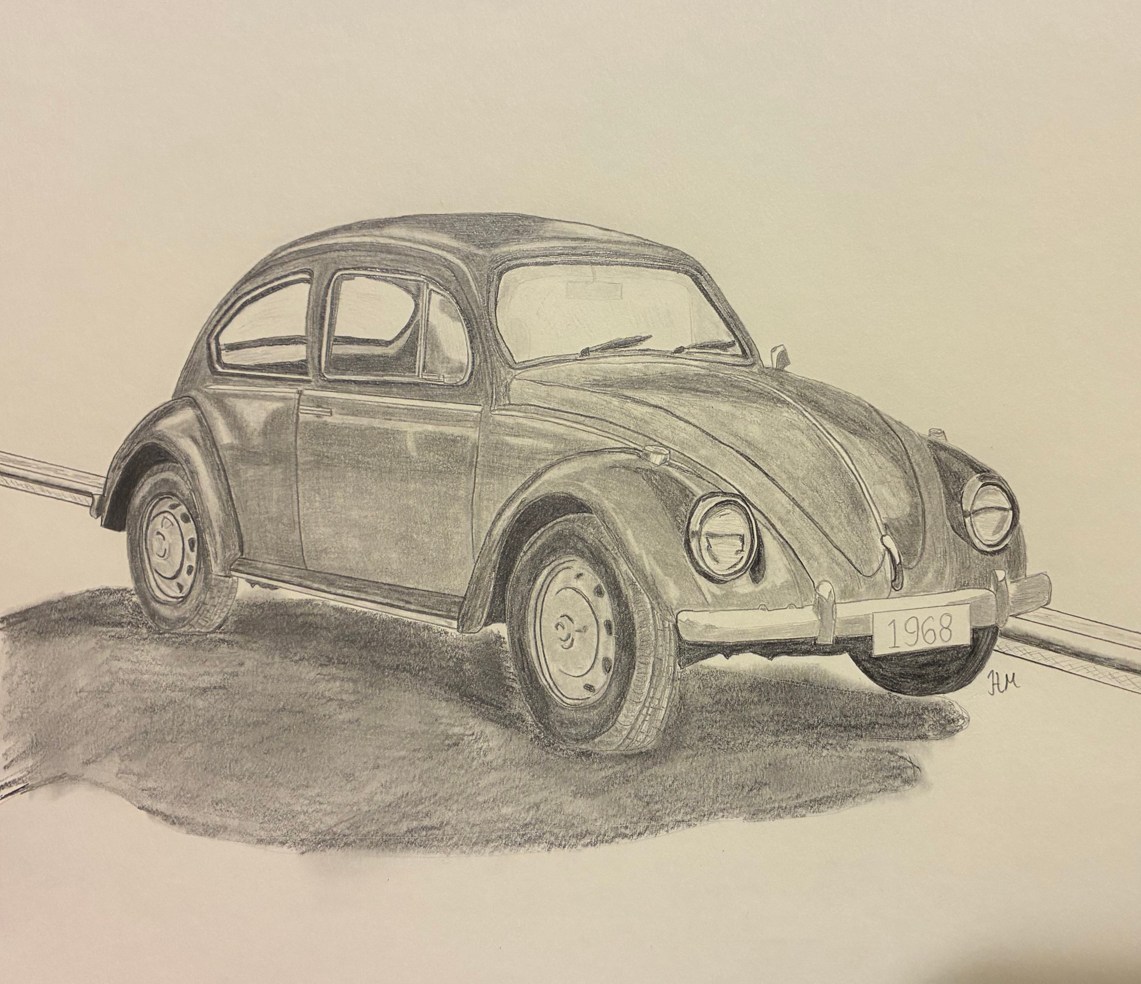
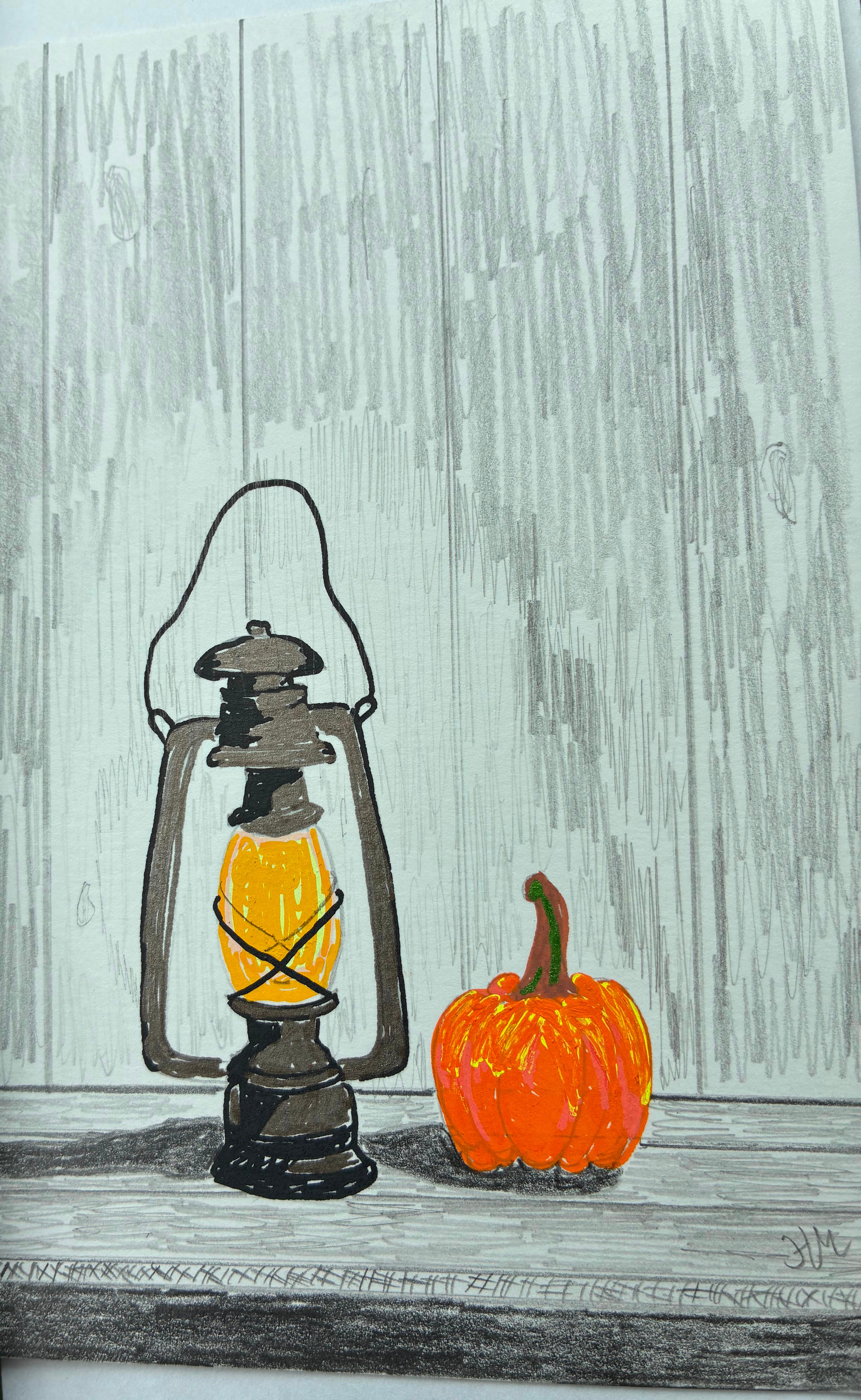
Sometimes it’s a nothingburger — I just need to draw something. My recent VW Bug pencil sketch, for instance, was practical: I wanted to practice before doing a color version as a gift for Josh.
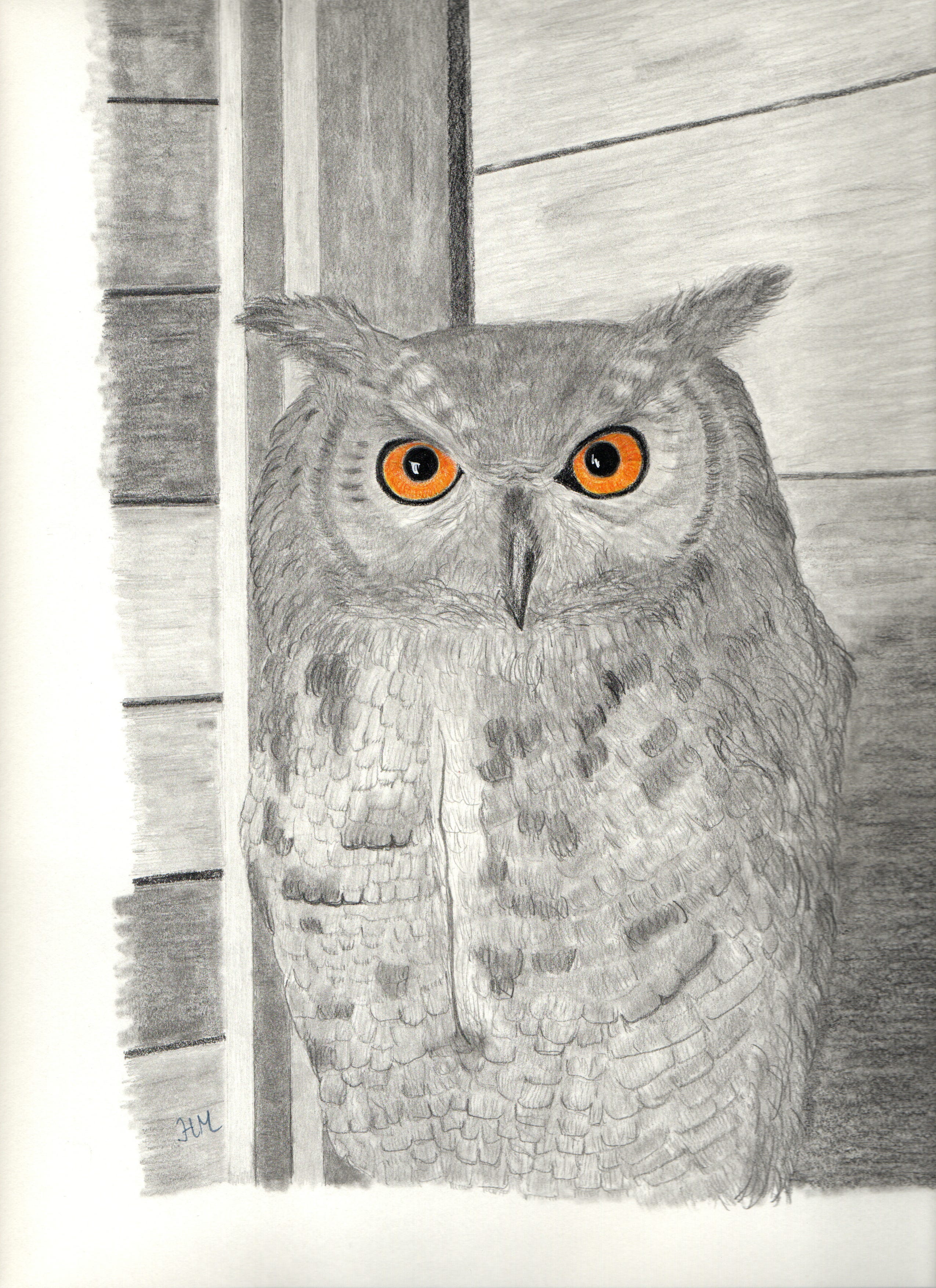
My Halloween owl happened because I wanted to play with selective color and make something that didn’t require emotional heavy lifting.
Other times, it’s about wrestling a particular technical problem into submission. I’ll decide I need to practice two-point perspective, or glass, or light through fabric, or something else that guarantees I’ll regret my choices about 40 minutes in.
Occasionally, I pick a subject because I saw a weird angle in real life that I can’t stop thinking about. You know that thing where your brain decides you must understand the geometry of a church steeple?
No? Just me? Okay then.
This time, the decision-making process was…less noble. I was depressed from my recent concussion and wanted to draw something to cheer myself up.
I love New England aesthetics and I love Christmas, and I’m also doing therapeutic work this year around trying to make Christmas mine — not some frantic overcompensation for how miserable the holidays were growing up.
So I knew I wanted a Christmas image. Something cozy, but not saccharine.
Something that could live in a snow globe without making me hate myself.
I also wanted to try something new: toned paper. For the uninitiated, toned paper flips the usual process on its head. You’re not building shadows on white — you’re carving out light from a middle tone.
It’s like making a drawing by erasing darkness instead of adding it.
Which is very poetic if you’re in the right mood, and extremely humbling if you’re not. But I wanted the challenge.
The problem, of course, is that I try to respect intellectual property, so I can’t just grab a pretty winter barn photo off Pinterest and go to town. I could have gone outside to take my own reference photo, but I live in Vermont and it was cold and I was concussed, so the odds of that happening were…slim.
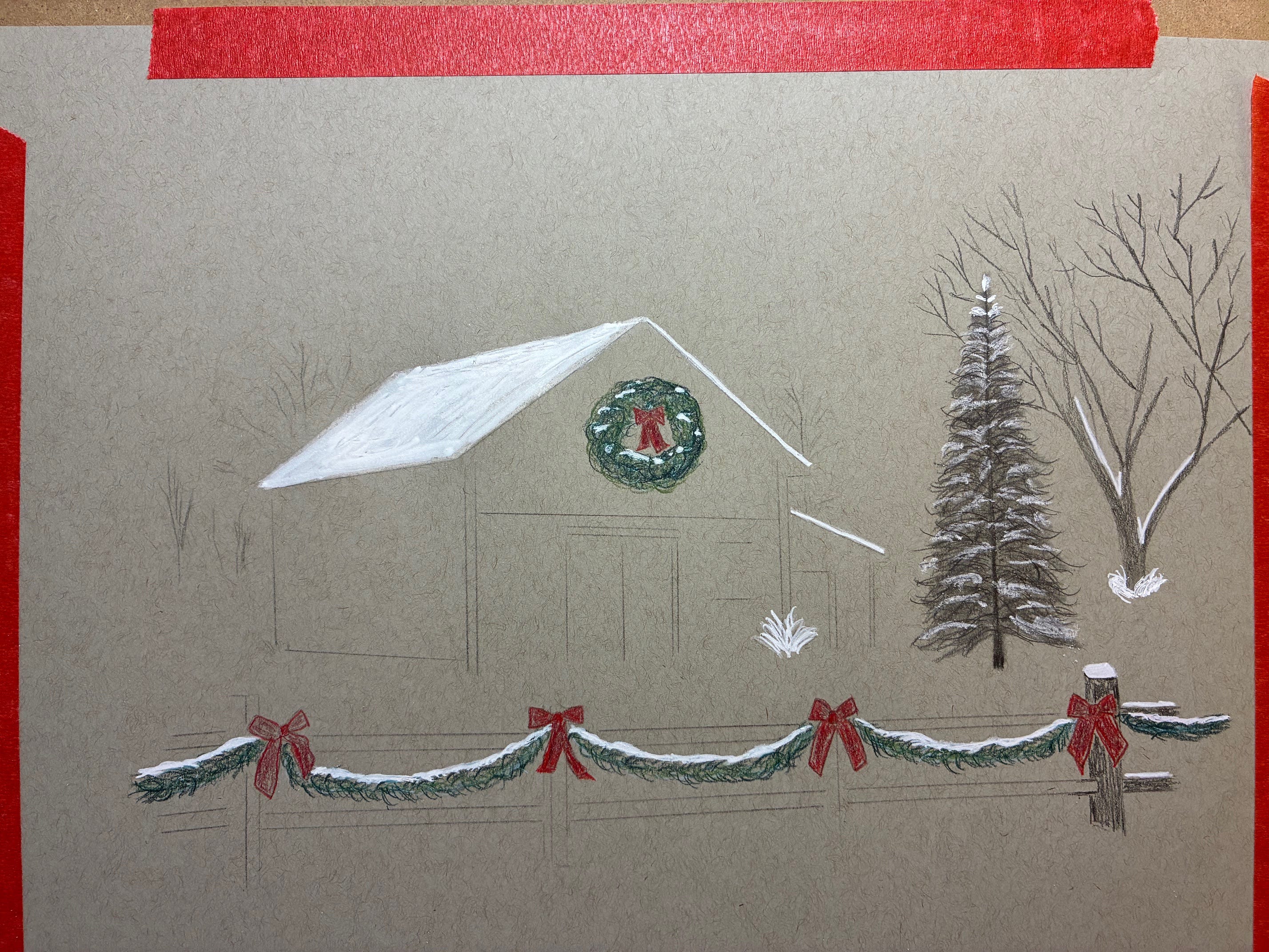
So instead, I described what I wanted to ChatGPT: “a classic New England barn decorated for Christmas — snow on the roof, big wreath, wooden fence with garland, maybe a lit tree nearby.”
After a few iterations that looked like the uncanny valley version of a Thomas Kinkade painting — one of them had a barn that looked suspiciously sentient — we finally landed on this.
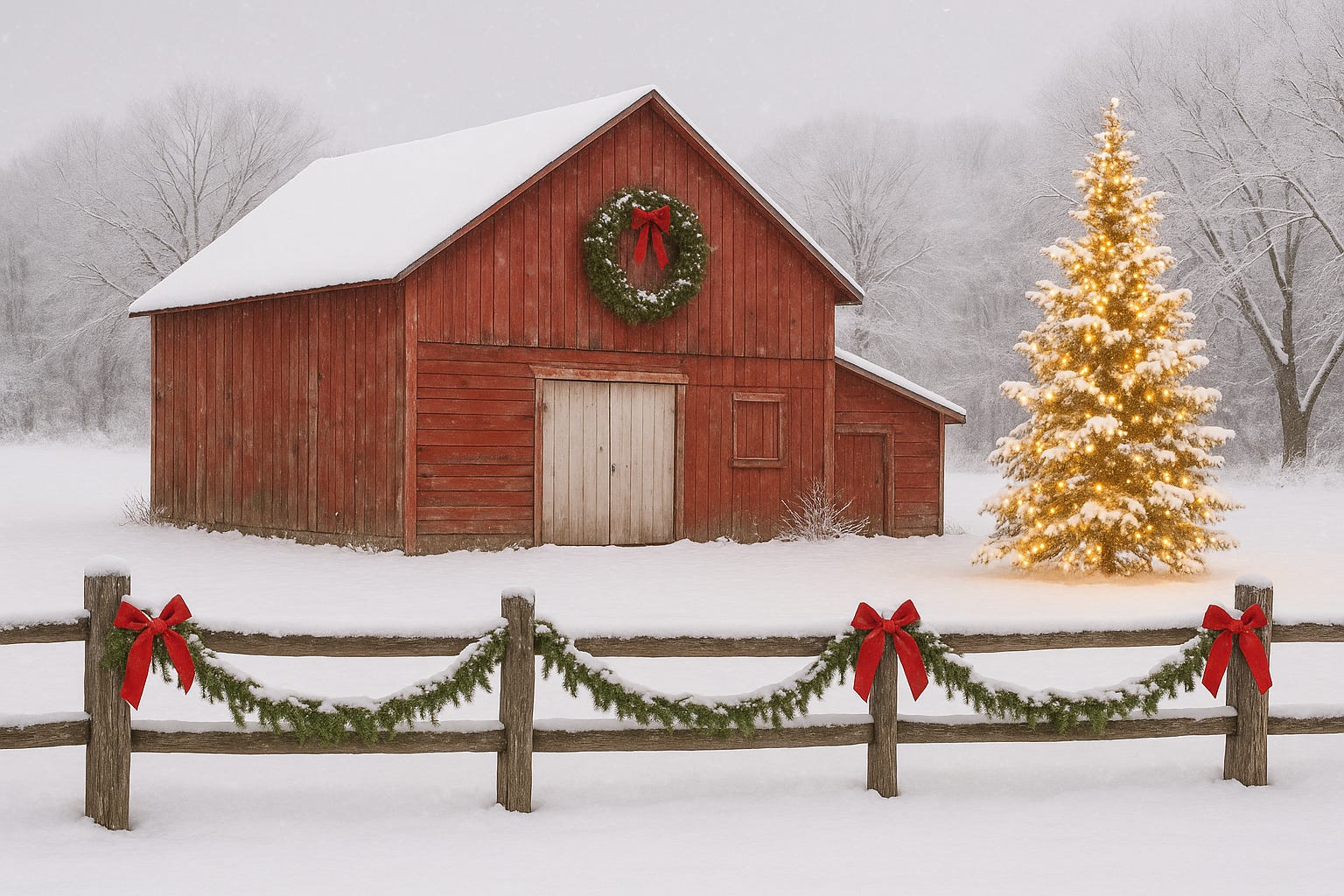
A weathered red barn with a giant wreath, a snowy fence wrapped in garland, and a Christmas tree glowing beside it like it’s auditioning for a Vermont tourism brochure. It was almost perfect: festive but not smug, nostalgic without being emotionally manipulative.
Basically the holiday spirit, minus the baggage.
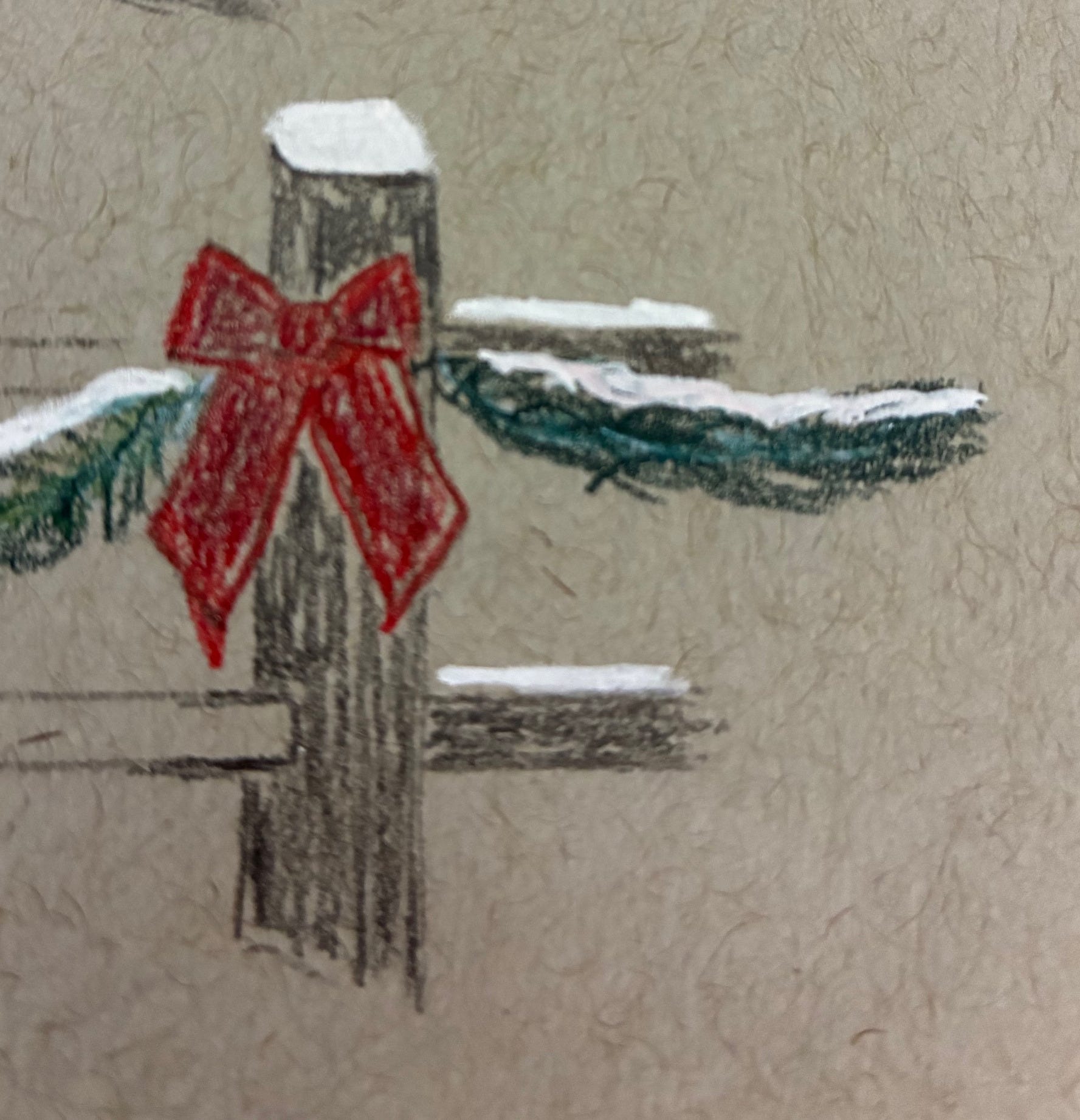
But notice that there’s a missing red bow — I didn’t ask for that, and I’ll fill it in myself. It’s a typical LLM mistake. LLMs are not people and have limitations, though the doomers would have you believe they’re so uber capable that they’re ready to kill us all.
The next decision is how much color to use.
The barn, being a respectable New England barn, is of course red. But I decided not to color it. Instead, I’m doing my usual selective-coloring trick: the wreath and the decorations on the fence will be the only parts in color, everything else in graphite.
I know, I know — it can feel like cheating. Half the emotional power of selective color is just the audacity of having any color at all.
You can put a single red bow on an otherwise grayscale scene and people will act like you invented pathos from scratch. It’s the drawing equivalent of whispering in a crowded room.
Still, I love it. It’s a little cinematic, a little manipulative, and frankly, it works every time. I’m like the person who insists they don’t like jump scares in horror movies and then designs a drawing that’s basically a jump scare in green and red.
The other reason for limited color is that I’m still learning color theory; when I go full color, I’m one step from inventing a new species of visual chaos. So for now, I’m keeping the palette contained to an area small enough that I can’t ruin it.
Even within that, though, I’m layering carefully — because color isn’t just “green.” For the wreath and garland, the base layer will actually be blue, to give the greens depth and shadow.
Think of it like emotional layering: under every cheerful pine needle is an undertone of cold and shadow.
You’ll see it in the pictures to come. For now, just imagine me hunched over my drawing table, muttering about complementary hues and pretending I understand saturation like it’s a moral quality.
Next comes setup, otherwise known as “the part where normal people would just start drawing, but I instead stage a small logistical operation.”
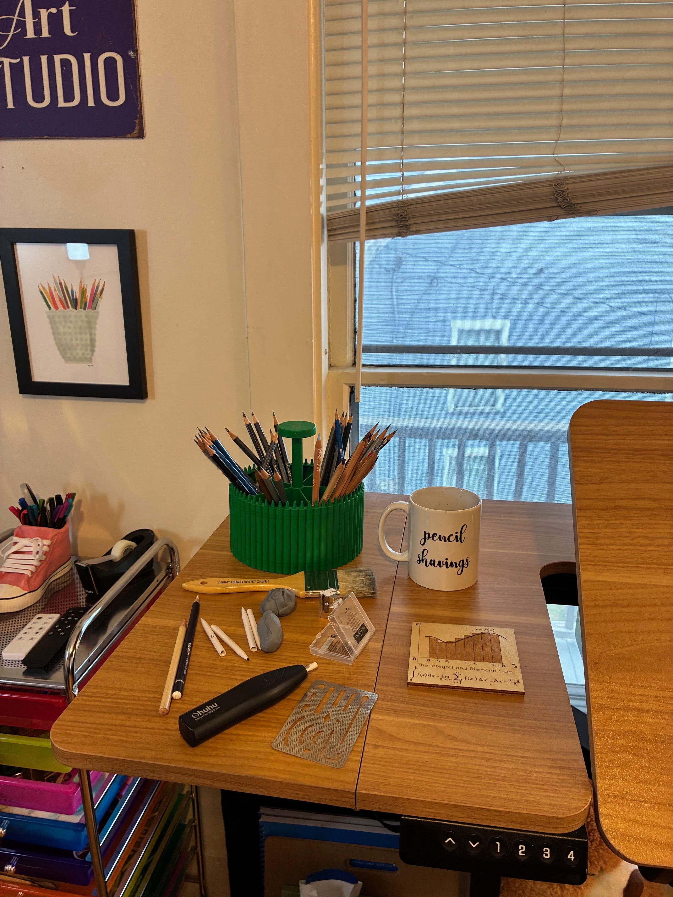
First, I get fresh blending tortillons for the graphite—because nothing ruins a snowbank faster than smudging it with leftover shadow from a raccoon drawing three weeks ago. Then two kneaded erasers: one for actual use and one as a designated fidget-spinner substitute for thinking.
If you’ve never absentmindedly kneaded an eraser into a tiny, doomed snowman while contemplating composition, do you even art, bro?
I also grab my trusty brush for keeping graphite dust and eraser crumbs off the paper. You could blow it away, sure, but that’s a great way to add permanent spit texture to your skies.
Ask me how I know.
Then I reach for the sacred relic of my process: the Crayola carousel spinner. It’s meant for children, which feels appropriate, because I too should probably not be trusted with sharp implements.
I load it up with my entire graphite range — from 10H (so hard it could etch glass, typically used for fine details like flyaway hair or the veins in an eyeball) to 9B (so soft it might collapse under the weight of its own emotional sensitivity, used for the darkest darks).
I add a few Faber-Castell eraser pencils for precision fixes, and the colored pencils I’ll be using: Caran d’Ache Luminance. They’re lightfast, beautifully pigmented, and priced like they know it. I’m using them because I plan to sell the original when it’s done. For something that I need to last a few decades and not a century, I use Prismacolor or Polychromos, which are gorgeous but not rated for centuries of lightfastness.
(Snow tires were expensive this year, my former landlord is withholding the security deposit despite my standard of housekeeping being so good that it would take no more than half an hour to convert my living space into an operating theatre, and art is apparently my financial coping mechanism.)
Next: two sheets of tracing paper to rest my hand on while drawing, so I don’t smear everything into a graphite Rorschach test.
Electric eraser: check.
Tombow erasers for microscopic highlights: check.
Everything gets sharpened — graphite in the electric sharpener, Luminance pencils by hand, because I’d rather sandpaper my soul than waste one millimeter of those.
And finally, the mug labeled “Pencil Shavings.” It exists solely to prevent me from accidentally consuming graphite dust when I get in the zone. (This system is only 99% effective.)
Now I’m ready to get started with the actual drawing.
And just so we’re clear: everything I know, I taught myself — which means I’m not only weird, I’m self-engineered weird. There’s no normal baseline for comparison.
Somewhere out there, art teachers are reading this setup ritual and whispering, “My God, what have we done?”
Reference Photos Are Good
Once you’ve got your reference photo, there are two main ways to set up a drawing. But before we get into that, let’s talk about the reference photo thing for a second — because I used to feel weird about it, and I wish someone had told me sooner not to.
When I first started drawing, I thought using a reference meant I wasn’t a “real artist.” Like somehow, Real Artists™ just conjure photorealistic barns out of the mist, guided only by divine inspiration and a faint smell of turpentine.
Then I started hanging around places frequented by actual professionals — art forums, online classes, magazine submissions — and it turns out literally everyone uses reference photos. It’s not cheating. It’s the standard.
In fact, Colored Pencil Magazine (and most other professional competitions) just assume you use a reference photo. Their entry requirements make it explicit: if you didn’t take the photo yourself, you need a photographer’s release. There’s no checkbox for “I just made it up out of my head.” That’s how common this is.
So if you’re stressing about that the way I used to — please don’t. Reference photos are part of the process, not a moral failure.
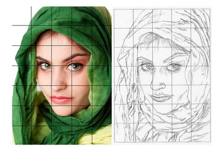
Now, on to the two main ways people handle the setup: the grid method and tracing.
The grid method is the more old-school of the two. You draw a grid of equal squares over your reference photo (or use an app to do it digitally), then lightly sketch the same grid on your drawing paper. From there, you copy what you see in each square — basically translating little bite-sized sections of reality. It’s slow, meditative, and a great way to train your eye to see proportions accurately instead of guessing. If you’re just starting out, it’s one of the best exercises you can do.
The other approach is tracing, usually with the help of a light box.
You place your reference underneath your drawing paper, turn on the light, and trace the main outlines — just enough to get the proportions right. It’s efficient, it’s clean, and it’s not the cop-out people think it is. Plenty of professional illustrators use tracing to save time and keep their compositions consistent.
I’ve used both methods, and both are excellent ways to self-teach. I own two sizes of t-square (the tool most people use to draw grids by hand) and they’re how I got good at eyes and noses.
In the very beginning, when I traced, I traced almost everything because I didn’t trust my hand-eye coordination.
Over time, as I practiced more and started seeing shapes instead of “objects,” I began tracing less. This was a wonderful marker of my growing skill — gradually tracing less and less.
I also do a lot of drawing from life, using a ruler, a protractor, and my arm fully extended (doing the math in my head, which is also fun) to replicate angles and proportions. But for something I intend to sell, I want more precision than that.
The combination of precision and challenge is to trace a few guiding lines and freehand the rest.
For this piece, I decided to keep things simple — which, for me, means marginally less complicated than a hostage negotiation with my own perfectionism.
The shapes are straightforward, so I’ll trace only the rooflines of the barn. Then I’ll mark the very top and bottom of the tree to the right of the barn and the vertical posts on the fence, to help with placement, then freehand the rest.
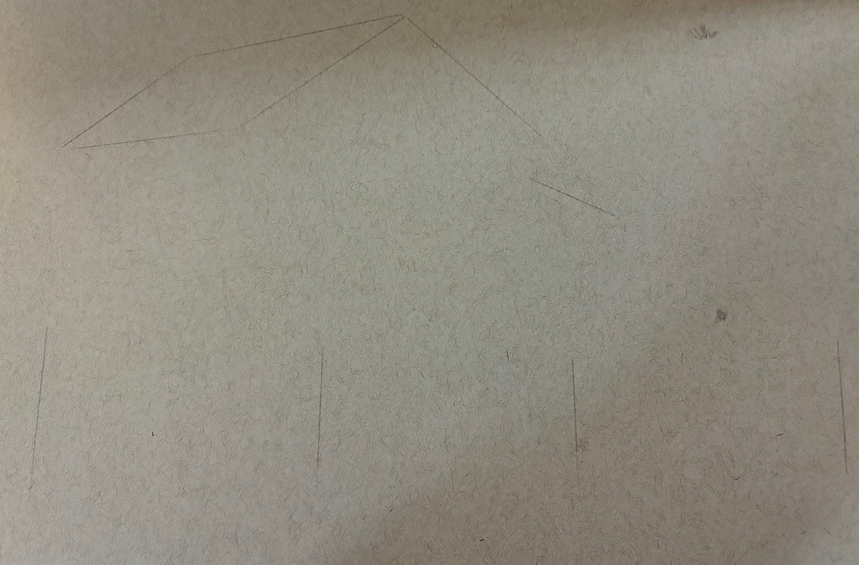
Starting here is perfect. It’s just enough structure to keep me from accidentally turning the roof into an avant-garde ski slope, but still enough freedom to feel like I’m actually drawing and not just coloring inside someone else’s lines.
I’ll use a light touch and finish the outline with graphite and a ruler.
And here’s my first mistake: I used sketch paper.
Sketch paper is light and toothy, great for practice and graphite, but it buckles under wet media and doesn’t tolerate repeated layering.
I should have used mixed-media paper. Mixed-media paper is heavier, sized to handle light washes, markers, and layering without warping.
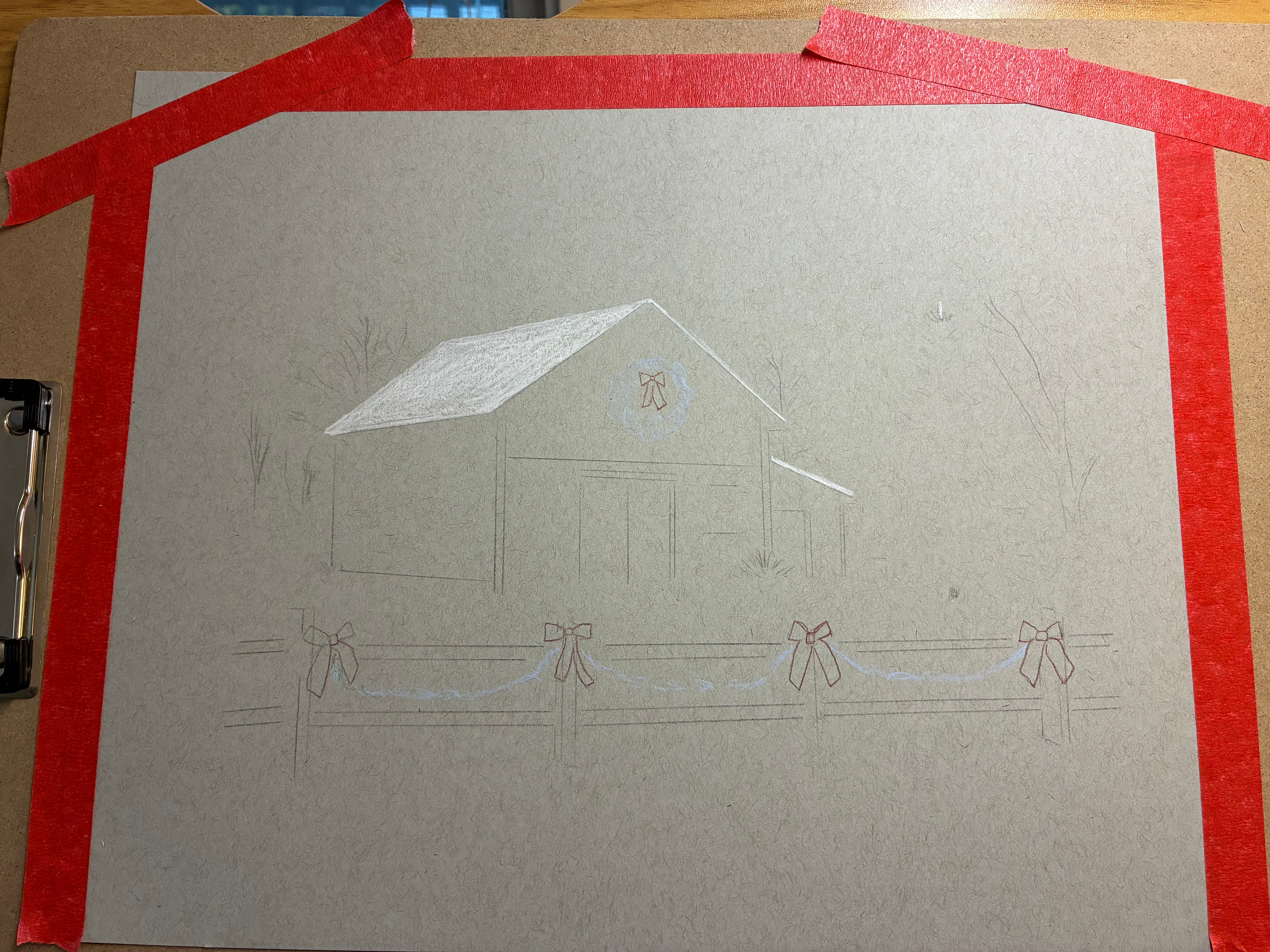
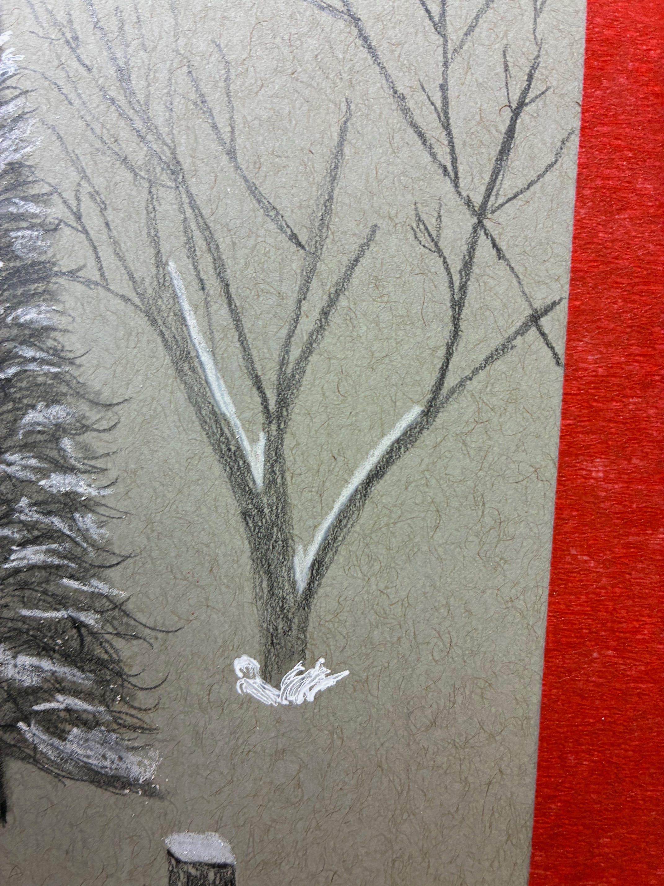
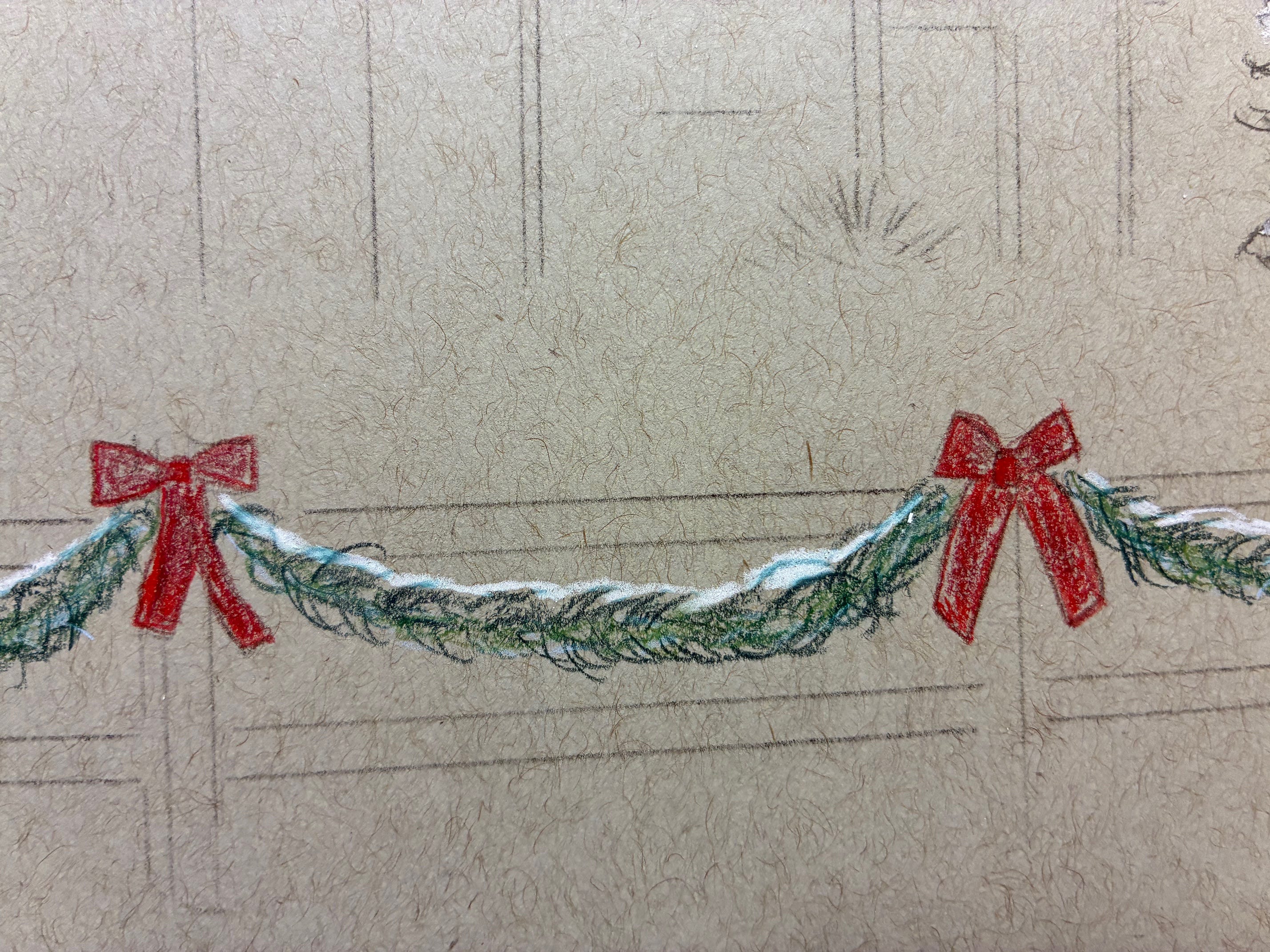
It’s my first attempt at gray toned paper, which is a challenge because the whites — in this case the snow — is solely my responsibility. In the normal case of white paper, the white of the paper would be the white of the snow.
Notice that I’m not outlining the garland connecting the bows on the fence — I’m going to freehand those from start to finish, as a bit of a challenge. This is risky because color is almost impossible to fully erase, whereas graphite can be erased quite thoroughly, but I’m wanting to set up habits of challenge right from the start now that I’m working with toned paper.
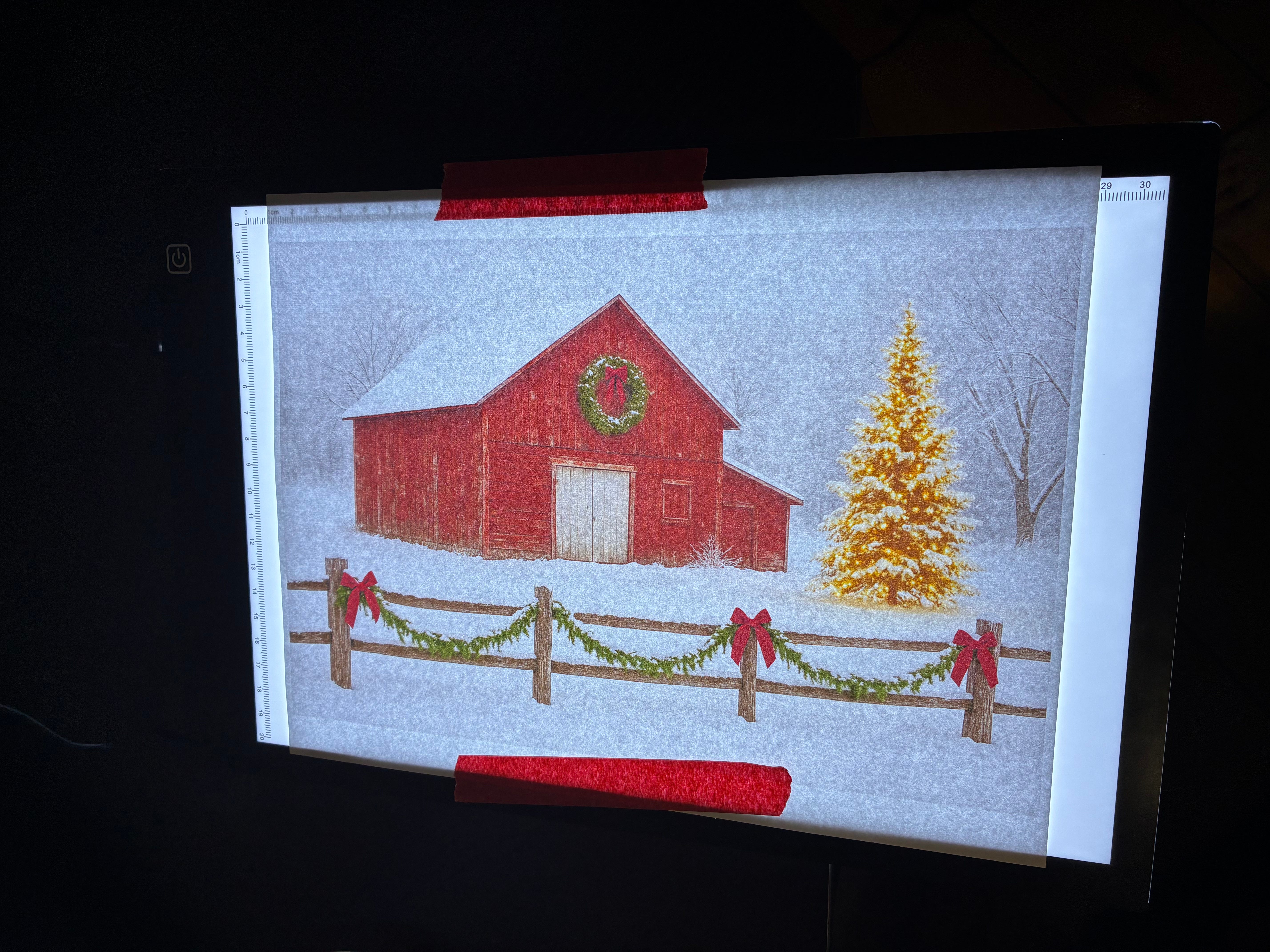
A couple of hours after taking it off the light box, I have my outline:
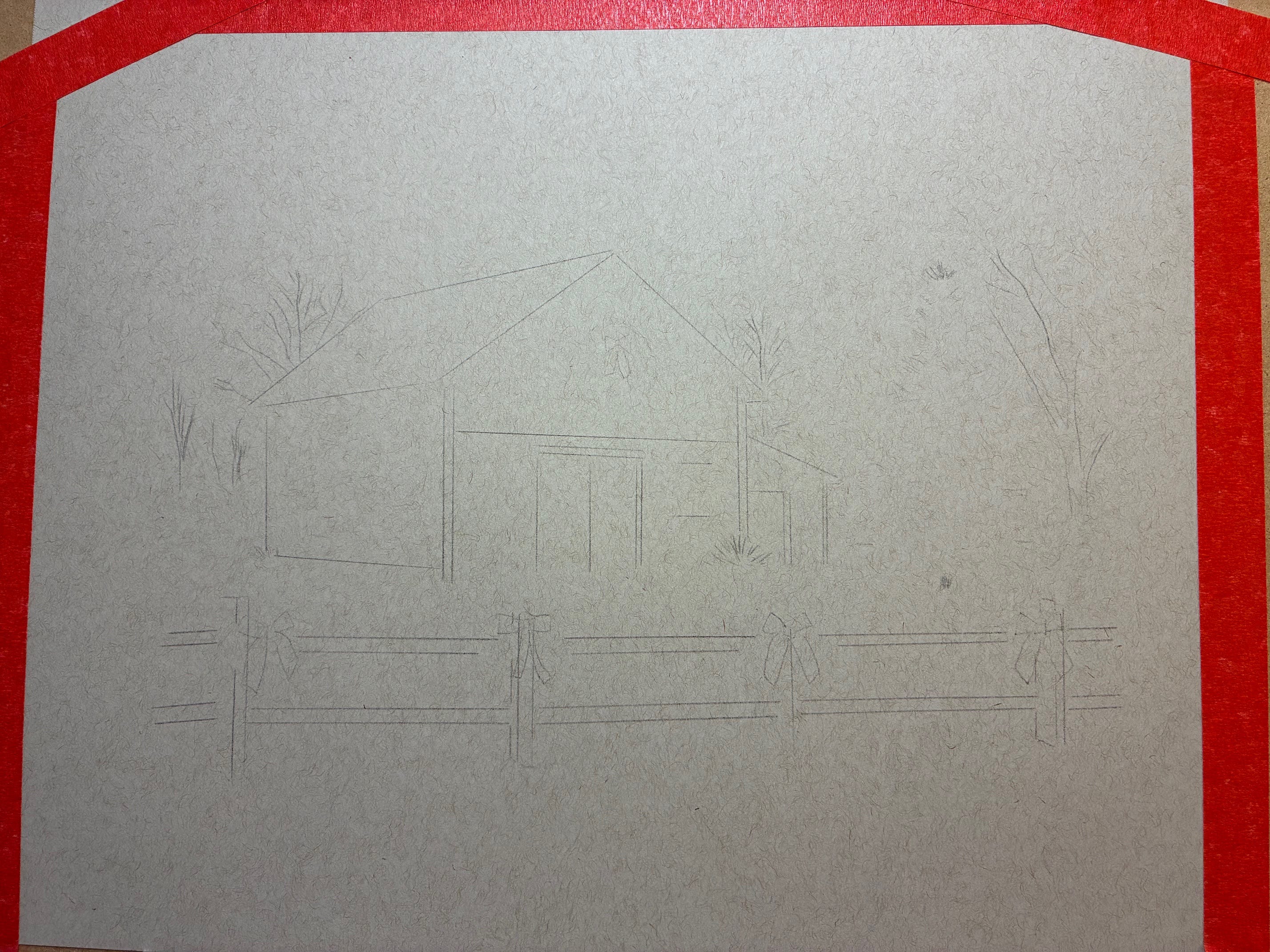
Once I think I have the outline right, I hold it up to the reference photo and squint like an old detective trying to match fingerprints. If nothing jumps out as wildly deformed, I call it “close enough” and move on.
At this point, I’m slightly nervous. I’m so used to drawing on white paper that gray feels like I’ve accidentally turned the brightness down on reality. I’m realizing I’ll have to go much darker than usual for contrast — normally I’d start with an H pencil for the outline, but on gray paper, that’s invisible. So I’m upgrading to HB, which feels like switching from a scalpel to a butter knife.
Luckily, my friend
gave me these absolutely glorious handmade HB pencils from a Japanese artisan for my birthday last summer. They’re so smooth and beautiful that it’s almost sensual, which is unsettling because I’m talking about pencils.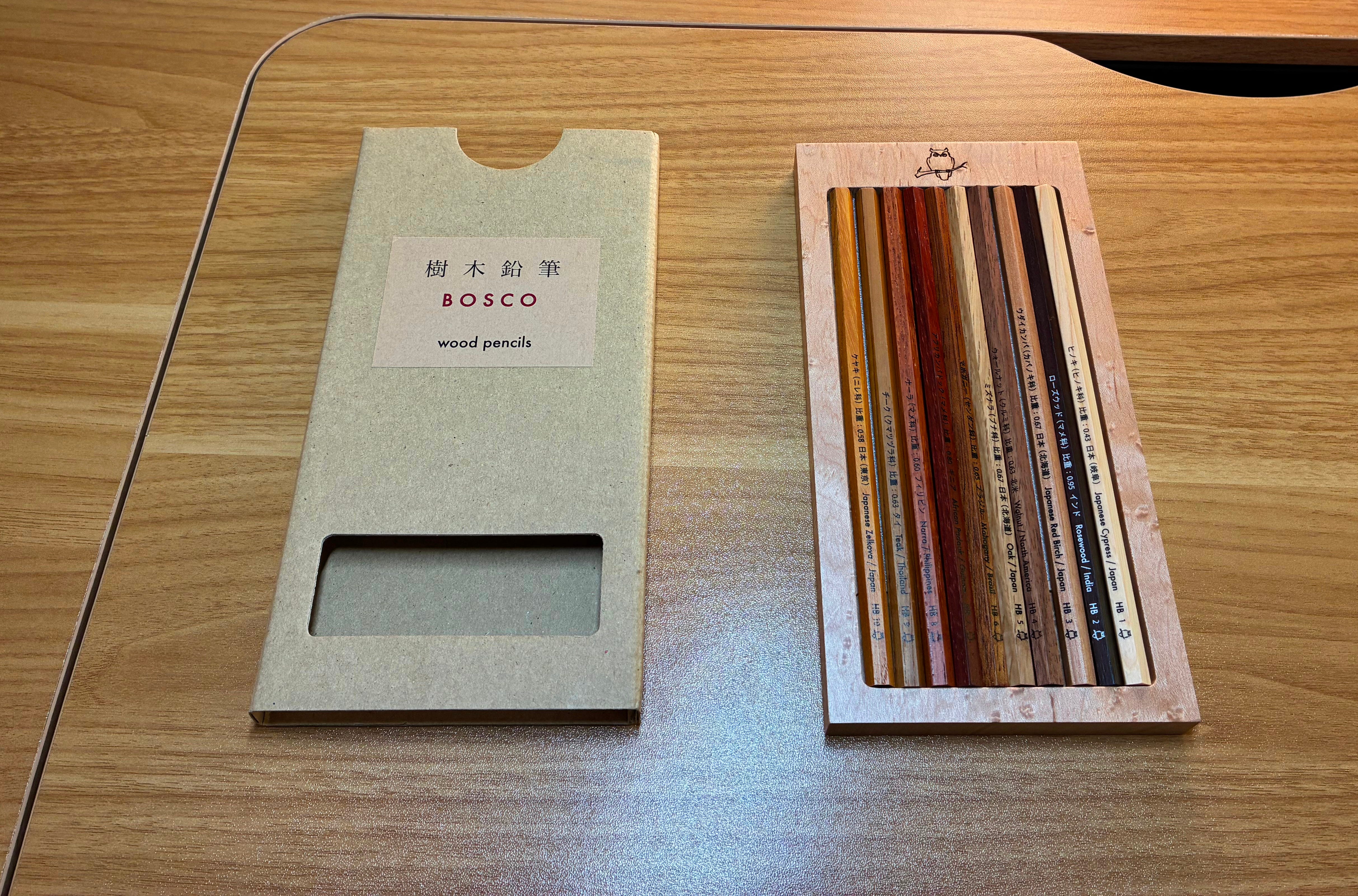
Still, they make even the terrifying gray paper feel like a friendly challenge instead of a personal attack.
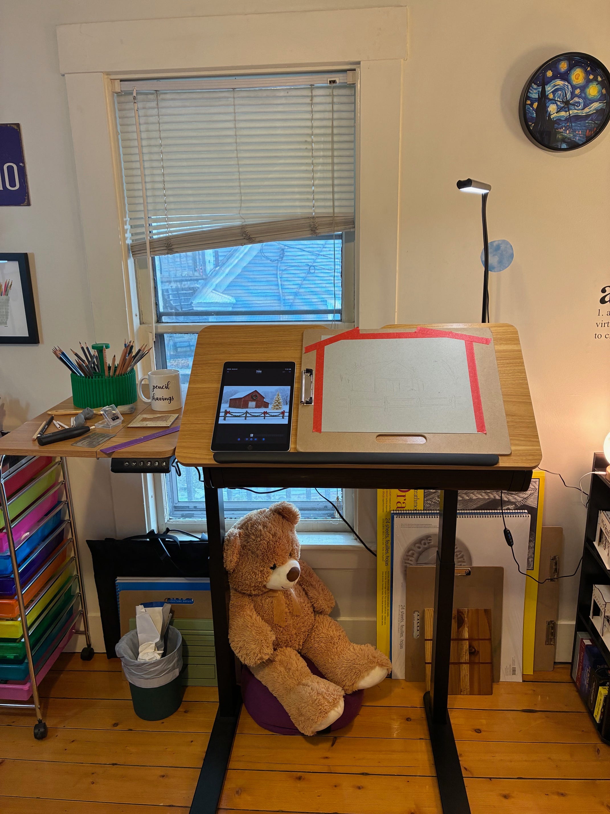
Now I’m ready for the process that will have me return to my drawing table over and over for the next couple of days. Reference photo on iPad (so I can zoom in and out and examine details) and the aforementioned setup in place.
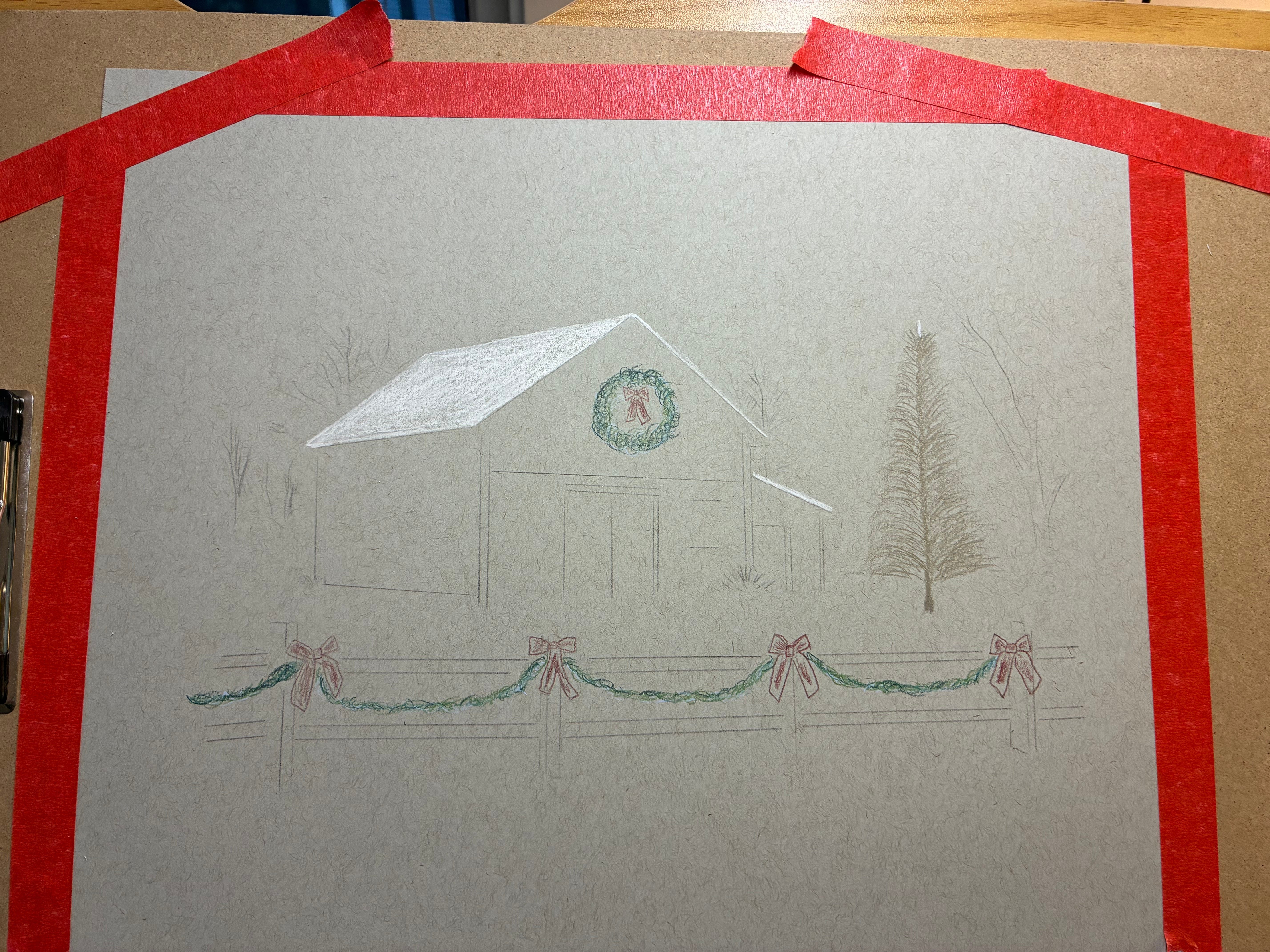
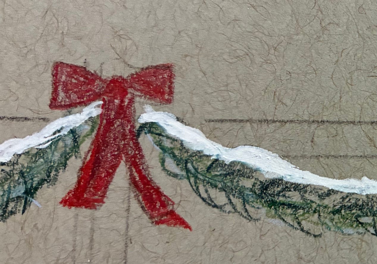
Once the outline’s solid, I move on to the base layer of color — white for the snow rooflines, blue under the greens and brown ochre under the reds. That sounds fancy and intentional, but really it’s just me trying to sound like I understand color theory. (I do not.)
The blue gives the greens a kind of emotional depth and chill that says “winter,” while the brown ochre keeps the reds from looking like lipstick.
I put a layer of brown in on the tree I’m not going to light. I was on the phone and did this by accident, having previously decided on graphite for everything but the green and red Christmas stuff. I got distracted and put in some brown while I was in a rhythm after the first layer of green atop the blues.
After some thinking, I decide that I’ll erase a lot of the brown and do graphite on top of it. This is a risk, but the whole thing is an adventure.
It worked shockingly well.
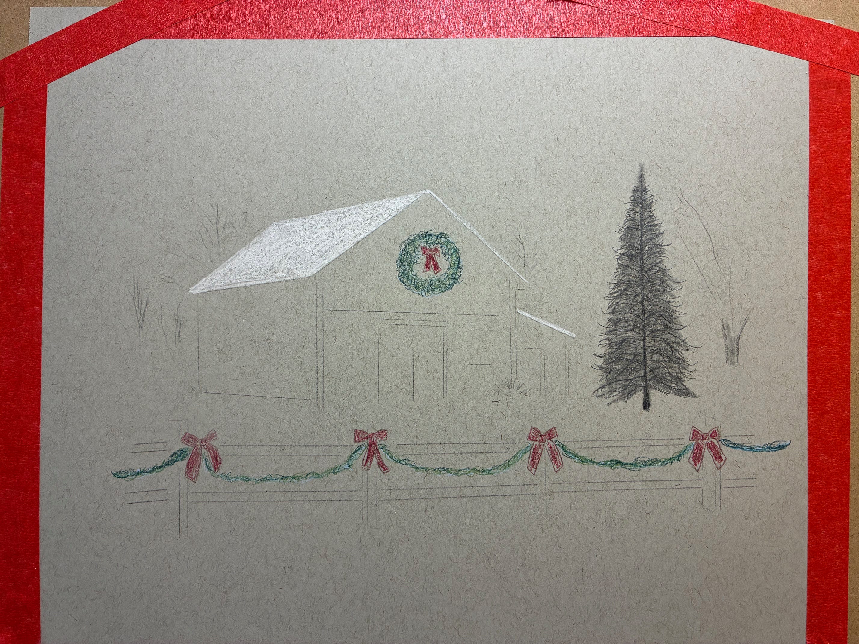
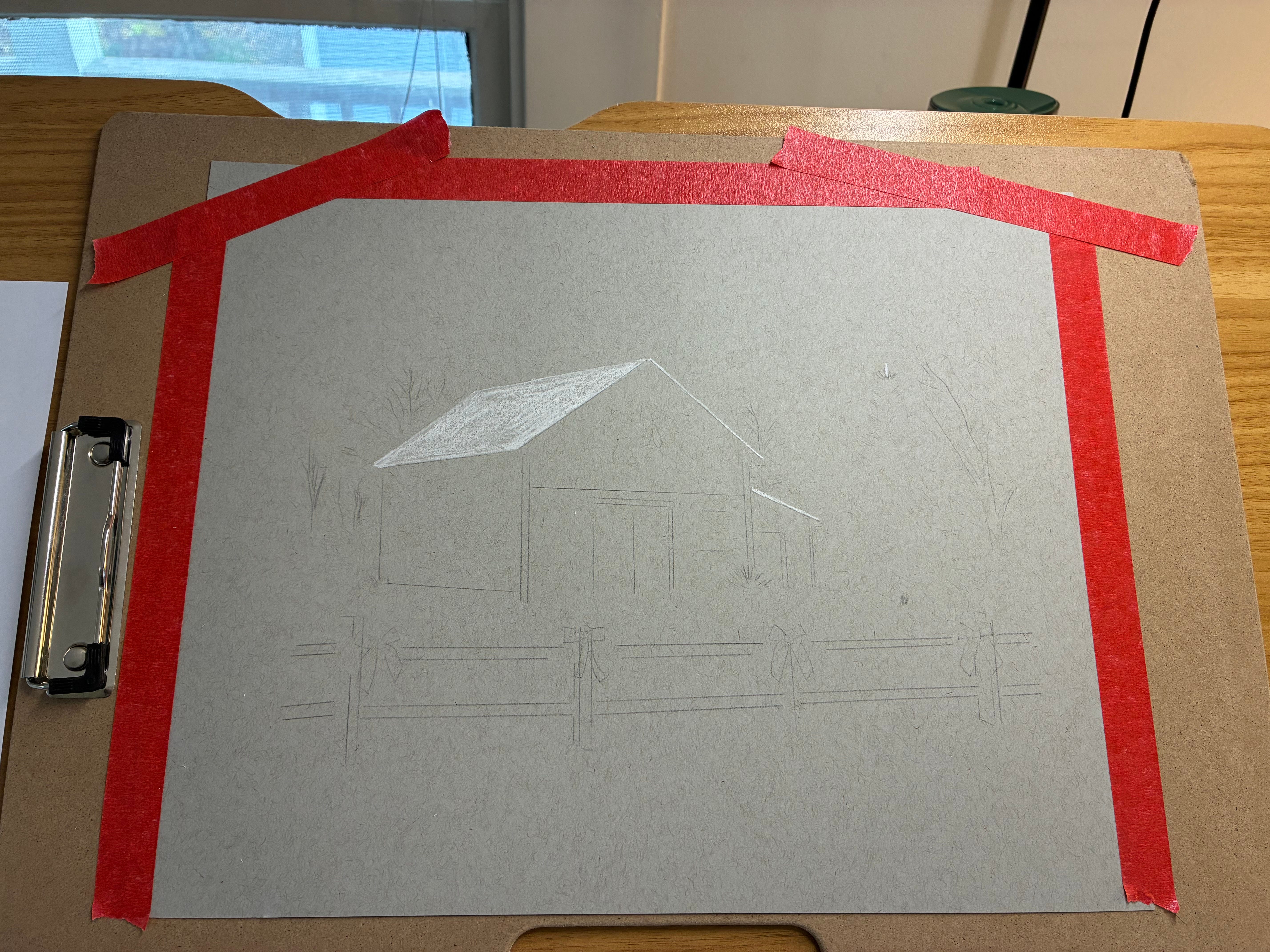
When I added show, using both a white charcoal pencil and the corner of a white charcoal stick, I couldn’t believe how good it looked.
At this point, I realized that figuring out a way to get the snow right was the only thing that mattered.
So I worked on that instead of my usual process.
Typically, highlights come last. By then I’m in a semi-automatic state, reaching for the right graphite grade without thinking, working in 20–30 minute blocks over a few days that add up to ten to twelve hours, circling back to each area until the values click.
But this experiment, using gray toned paper, was so new that when I figured out I needed to get the highlights right first I just focused on it.
I knew that the Caran D’Ache Luminance white pencil would work perfectly on any part of the page that didn’t have graphite or other colors on it, but there were so many places where snow was on top of other things.
I tried several other types of white — white colored pencil atop other colors just seemed to make mud, white gel pen didn’t look as good as white chalk — so I decided to try my Ohuhu acrylic paint markers.
Acrylic paint markers are opaque, quick-dry paint in a pen body; they reward the same pressure control and edge discipline as pencil but lay down solid whites over dark layers. They give painting effects with drawing skills, essentially.
Paired with graphite or colored pencil, they create a beautiful, slightly raw contrast that reads as snow without turning chalky.
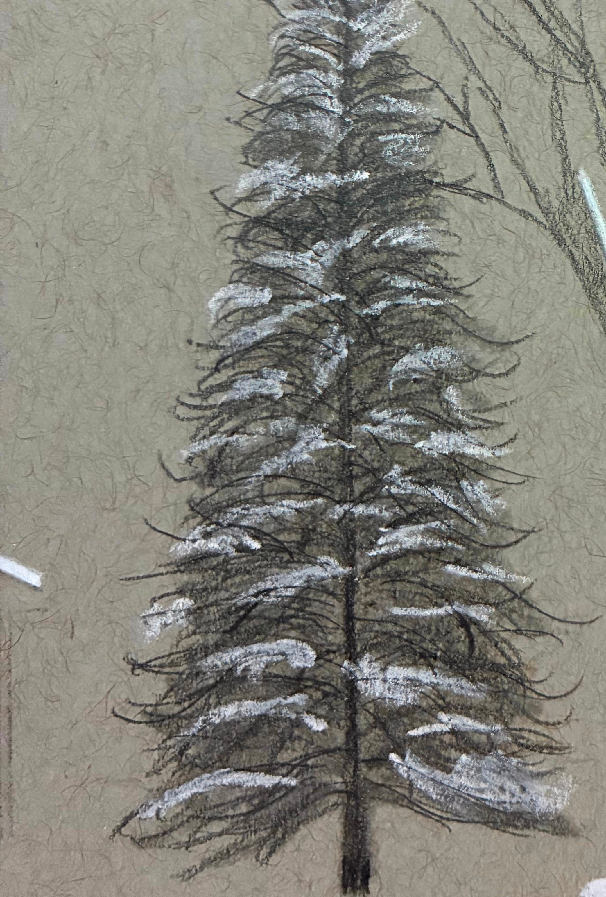
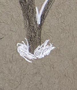
This worked better than I could have imagined. Adding snow to tree branches:
It transformed the mud of white colored pencil atop green:
To actual lovely snow:
So I used it for the white of the snow on the rooftops as well:
It worked beautifully — with one problem.
This was sketch paper. Good quality, yes, but still sketch paper.
Meant to take, at most, a couple of layers of graphite or color.
And I was applying acrylic paint to it. Multiple layers of acrylic paint, even.
Oops.
Choosing the wrong paper wasn’t the only mistake.
The white gel pen, which you can see at the very top of the lit tree and at the base of the one beside it, doesn’t hold a candle to white charcoal or white acrylic paint. It’s too glossy, too sterile — snow shouldn’t look like office supplies.
And while the brown under the graphite turned out to be salvageable, it would be better without it. Cleaner. Purer.
But these were productive failures. They taught me exactly what not to do next time — and more importantly, they didn’t make me want to quit.
The abstract portrait, though…eh.
I’ve tried to convince myself it wasn’t a failure at all. That it meant something just because I meant something by it.
But that’s not how communication works. If it didn’t make the subject want to look closer — and it didn’t — then it failed to achieve its purpose.
That will only become a productive failure if I ever find the courage to try again. I want to. Maybe I’ll get there by making one for
, someone for whom it would matter.I don’t quite understand how that would work. It would matter to Josh on its own merits, and not because I’m his friend and he loves me. (I don’t know why I’m sure of that, but I am.)
Perhaps I’m fooling myself, but I don’t think so. I think it would matter to him on its own merits, and that would give me the only thing I needed from it.
Or maybe I’ll just keep developing my ability to fail — from the kind that paralyzes to the kind that instructs, even when the lesson is emotionally crushing.
Maybe that’s the point, really — learning to trust that something can matter to someone else on its own terms, even when I can’t quite believe it yet.
And maybe learning to risk again means accepting that I don’t have to be sure first.
Either way, this was a fun experiment. A major thank-you to the readers who requested a “start to finish” drawing post — you led me in this direction!
I’ve got gray mixed-media paper now, the right tools for the job, and the itch to try again.
The next version of this drawing will be better. Not perfect, but excellent.
The original, flawed as it is, will be for sale. Email vtwriterartist at gmail if you’re interested in buying it when it’s done!
And prints are available of all my previous drawings.