This post has a ton of pictures and is also longer than most email clients can handle, so you may want to read it at the Substack website by clicking on the title above.
Edition 4 of Monday Morning Love
This is my series for starting each week of on a note of positivity! I write about something I love and publish it first thing Monday Morning, in an attempt to start the week off on a positive note.
I’m not going to put these behind the paywall, but if it motivates anyone to become a paid subscriber, my student loan balance would appreciate dwindling a bit in your honor, and there’s a special deal at this link. Comments are open for paid subscribers. Feel free to weigh in on what’s most interesting to you out of the topics I’m thinking about right now, as things I love and that it might be fun to write about—the novel A Widow for One Year, by John Irving; riding a bicycle; coding; Halloween; learning to draw in colored pencils after having gotten to a reasonably high skill level in graphite; the novel The Poisonwood Bible, by Barbara Kingsolver; learning to paint; finding unobtrusive ways to get more exercise in my day.
Edition 4: I love drawing
Substack’s schedule-a-post function has been messing up lately. I hope this will go out at 4:45am on Monday, August 12 but just in case it doesn’t — this is the Monday Morning Love post for the week of August 12, so if you get it early for some reason, save it!
I have written before about drawing, including some tips for how to teach yourself to draw (with my recommendations of specific resources), and a reflection on the spirituality of creativity, including the story of how I thought I’d never draw again but the miracle of cortisone shots gave drawing back to me.
Rather than repeat those stories here, for this one I’m doing a drawing from scratch with pictures at each step and a kind of how-to narrative, explaining what I love about the process at each point.
Step One: Choosing A Subject
What I love about choosing a subject is that the whole world is full of possibility. I can pick something I’ve drawn many times or something brand new. I can pick something challenging and put the work in on the proportions/perspective end, or something easier and put the work in on the fine details end.
For this one, I decided to ask fellow Substacker
what his wife’s favorite flower and bird are. I really enjoy his work and I wanted to send a drawing to his house. Drawing-as-gift is really fun and special. It gives the whole process a different vibe, uniquely joyful and anticipatory of sharing the joy. It feels very different than drawing for other reasons.Step Two: Choosing Reference Images
What I love about choosing reference images is all the times I get surprised in a wonderful way by what I find on google images, as well as all the times I get a surprisingly good picture of my own by taking pictures with my iPhone. I’m no photographer, but the iPhone has a great camera and often pictures taken with it turn out really well.
As mentioned, google images is the best source. A simple google image search will turn up all kinds of possible reference images for almost anything. Do your google search, then click on “images” at the top.
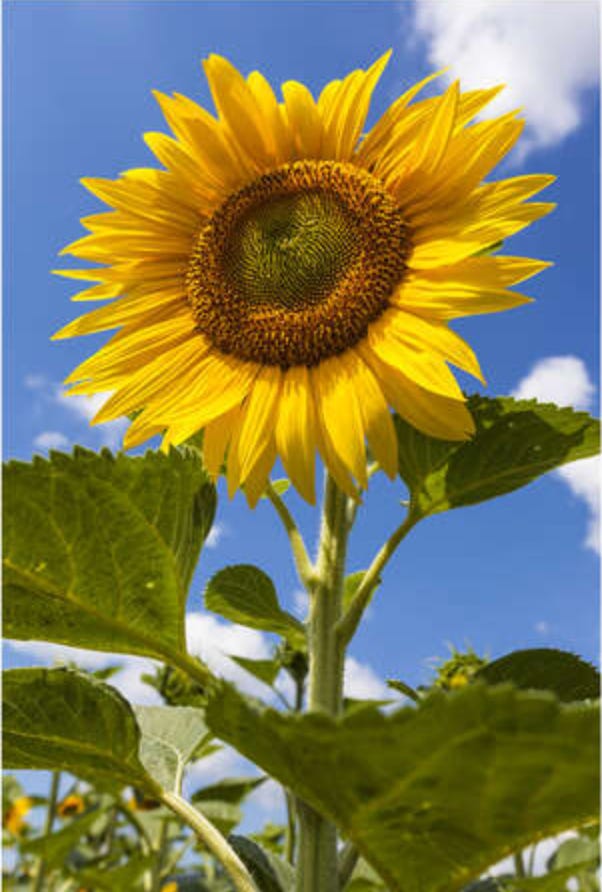
For this one, I chose these reference images since Mrs. Dad Explains likes sunflowers and cardinals. I’m including them here so you can see that the point of a drawing like this isn’t to just replicate the reference photos. Choices and artistic interpretation go into the process.
Step Three: Choosing Material
What I love about choosing materials is that it feels very personally freeing. Creativity is something I have had to fight really hard to let myself access and enjoy, and choosing what material to use feels like part of that liberation process for me, like ultimate evidence that I really am a grownup.
Choosing material is a crucial step. I often draw on bristol (a stiff, cardboard-like type of drawing paper) since I like to send my drawings through the mail as postcards, or to make my own cards for various occasions. Bristol is great for that, as the cards are just like Hallmark cards in that they will stand up on their own, can be displayed on a tabletop, etc.
For this one, the first choice is whether to use ordinary colored pencils or watercolor pencils. I’m going to use watercolor pencils for this one for two reasons.
One, it’s going to be a gift and I’m more confident in watercolor pencils. I’ve used them a few times over the years, and also they’re very forgiving. Mistakes in watercolor pencil often look purposeful because watercolor is such a loose, joyful medium. (I’ll fess up to my mistakes in this post, but just know that watercolor artists often don’t.)
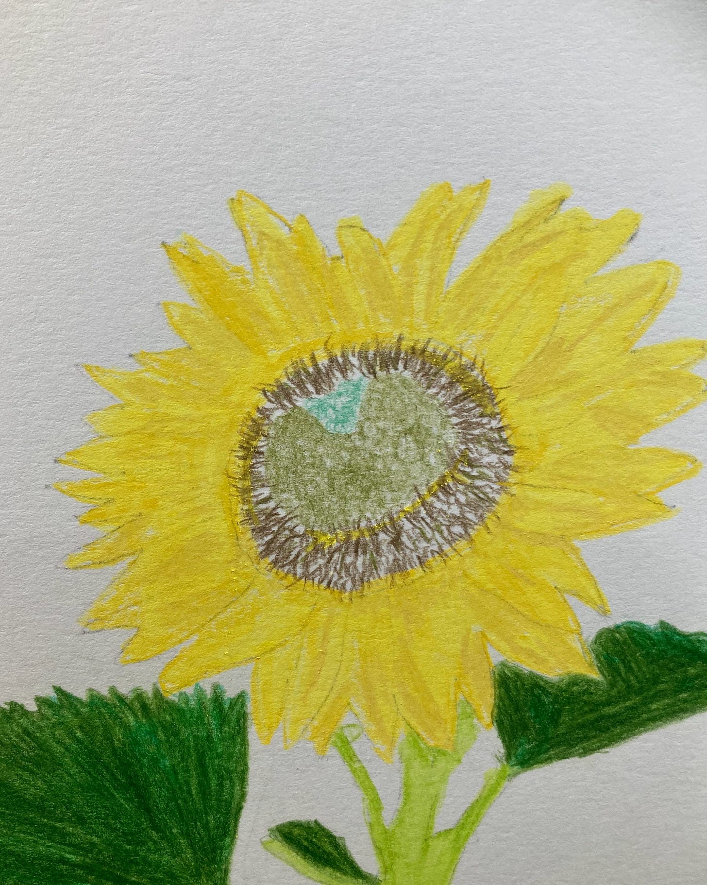
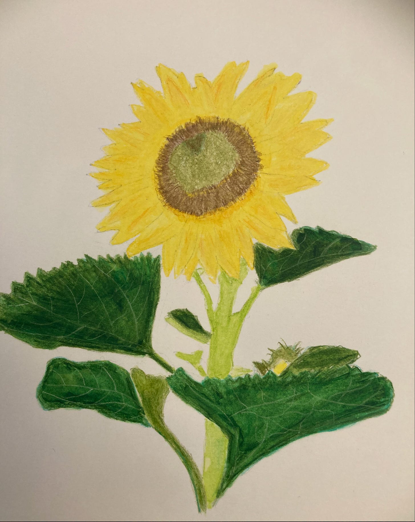
Here are two previous flowers I drew in watercolor pencils. Both turned out fairly nicely despite myriad mistakes, because watercolor pencil is quite forgiving.
Two, I’m working on learning colored pencils, both the normal kind and improving my watercolor pencil skills, but I’ve got a long way to go. Still, between the forgiving nature of watercolor and my being brand new at plain colored pencils, it will turn out a lot better in watercolor pencil than plain colored pencil. (Of course, something I drew in graphite would be way better than either of those, as my graphite skills are more advanced, but it’s more fun to do a color project right now since I’m working hard at learning color.)
Having decided on watercolor pencils, the choice here is really between watercolor paper and Mixed Media paper. Watercolor paper is rough and holds pigment in a very different way from normal paper, since it’s meant to be used with watercolor paints.
Mixed Media paper is thicker than drawing paper and meant to hold paint, water, or glue and additional types of media, but is still basically smooth to the touch and the experience of drawing on it feels like drawing paper.
I am working with regular drawing paper most of the time now, working on colored pencils. Since this is partly a learning project I will keep the type of paper I use as close to my normal drawing paper as possible. That way anything I learn along the way will be as immediately accessible and transferable as possible to my normal learning process. So I’m going with Mixed Media paper.
There’s a second level of choice sometimes, between cheap pencils and premium ones, but when I decided to learn color media I went ahead and bought premium pencils from the start. I learned when I switched from ordinary to premium graphite pencils that the quality difference is definitely worth using the more expensive materials.
Step Four: Choosing Placement
What I love about the process of placement is how everything seems possible at the very beginning. The choices start limiting possibility—every choice limits possibility—but at the point of placement, the possibilities all still exist.
These are two unrelated reference photos. I’m thinking I know how to place them, but I will try a few things first.
I almost go with this one, liking the spreading of the wings going a bit off the paper on one side and the sunflower growing out of the ground on the other side.
But ultimately I decide to just do the sunflower. I love the drama of the red cardinal in flight, but it’s very much a wintertime image, and I’m enjoying going outside as much as possible these days. The sunflower feels more like what I want to draw at the moment, so I go with that one. Also, it would seem a little weird to mix the two. I am sure I’ve seen red birds in warm months, so it’s not a biological impossibility, but it would still feel a bit “off.”
My favorite Christmas carol is “O Holy Night,” and I save this particular image because I think I want to do a Christmas card of my own this year, perhaps with this cardinal descending over a stable with a nativity scene.
I print the reference photos to help me play with possibilities, but I’ll use the digital version as my actual reference photos after I get the basic placement done. I put my iPad on the pencil tray of my drawing table. This is much more helpful than using a printed reference photo since I can zoom in and out and move around by using the iPhoto program functionality.
Step Five: Getting Started With Basic Placement
What I love about the basic placement process is how much easier it is now than it used to be. I’ve learned a lot through practice and studying a lot of methods, and this is so much easier than it used to be. It used to be frustration itself, taking dozens of tries to get basic placement right. Now it’s pretty rare for me to have to throw a piece of paper away and try again.
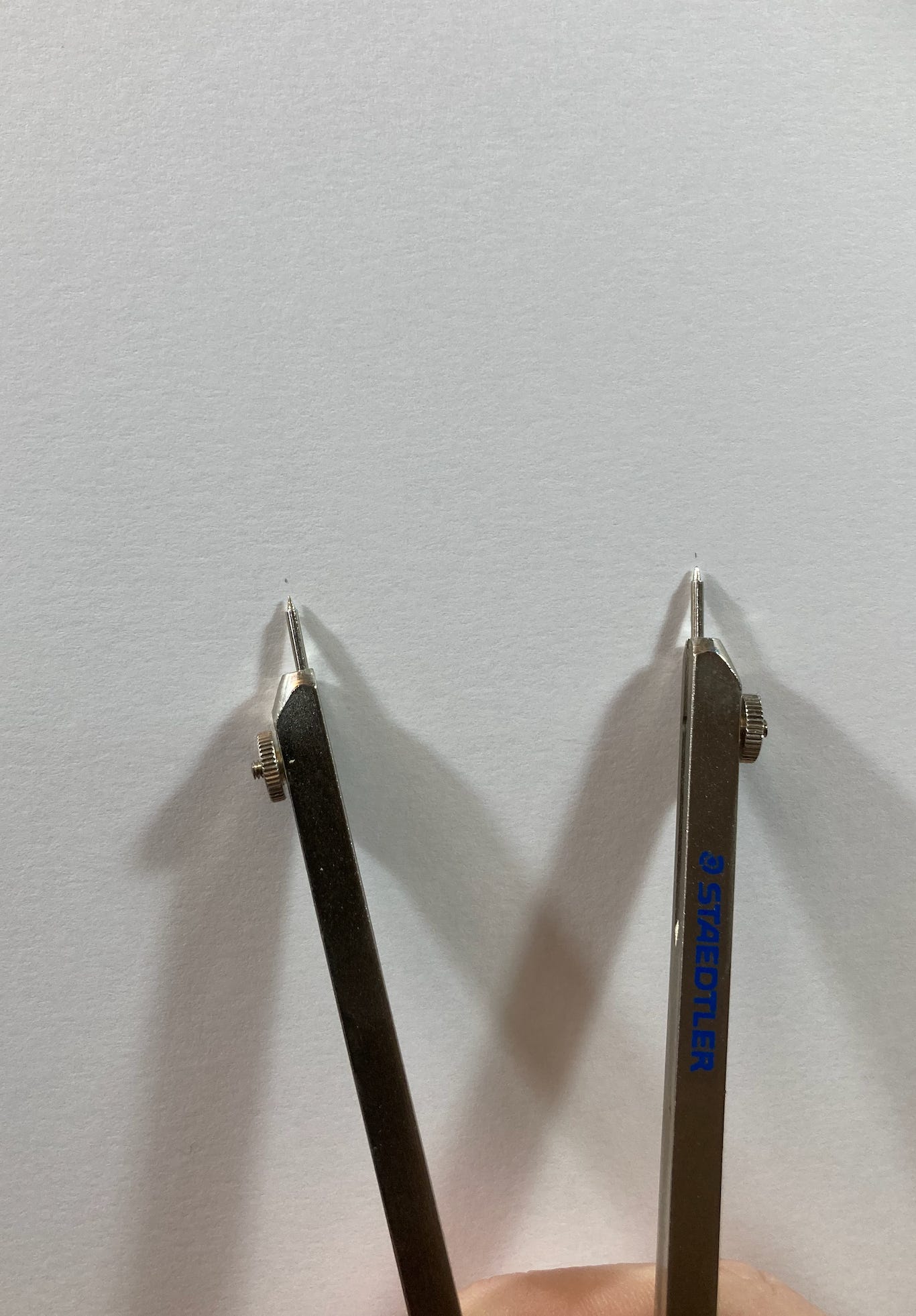
There are several ways to do basic placement, from transfer paper to grids. The method I like best for something like this, where I’m going to make the drawing the same size as the reference photo, is using a tool that lets me get the size right by making dots, which I do on the borders of various aspects of the drawing. I then connect the dots by copying the shapes.
For this, I use a sharpened pencil with an F lead, as that’s dark enough for me to see under my bright drawing lights, but still erases fully if I mess up.
This part takes a long time, as I need enough dots around enough parts of the drawing to confidently get the shapes right. I need many fewer dots than I used to, as my skills have grown, but I still need a lot. So this process goes on for awhile.
Here is the basic placement done. You can see evidence of erasing and re-drawing in several places, but this is a fairly accurate placement.
Notice that the stems of the flowers in the background, clouds, and other images behind the flower are not part of this. That’s the first major artistic choice. My thinking there is twofold. One, I don’t need all the images in the background to make this realistic. Correctly proportioned background images go farther than anything else to make an object look realistic, but I don’t need them.
I love the angle of the sunflower, but the background images in the lower left corner would be too “busy” and would likely distract from what I want to do. What appeals to me most about this image is the way the shadows turn the petals into so many shades of yellow, and the challenge of getting the leaves right, with the veins making interesting lines. The background images in the lower left corner are out of focus and won’t be helpful for what I want.
Now with the reference photo on the iPad, I’m ready. My other ongoing drawing project is moved up to the upper left corner of the drawing table. Artist’s tape is great for being able to move things around without damaging the paper or leaving sticky residue on the surfaces.
Step Six: Light Sources and Shadows
With the basic placement done, the next step is studying the direction of the light source in the picture, and where it makes the shadows fall. What I love about this part of the process is that the shadows are what provide realism and turn a drawing into something that looks like it was done by someone who can draw.
I spent my entire childhood wishing desperately that I could draw, but I had no opportunity to learn. As an adult, I rectified this and taught myself to draw, and the process of analyzing the light sources and shadows reminds me of the joy of learning—all the times of “oh wow, I’m actually getting better!” when I was first learning and started to improve.
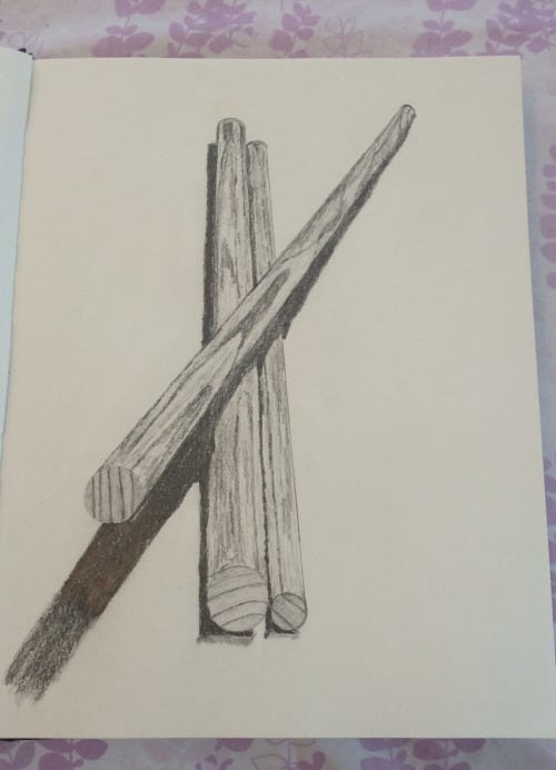
The key to realistic drawing and the appearance of a 3D object on a 2D surface like paper is getting the shadows right. This graphite drawing gives a good example of the power of shadows. What makes it look like the dowel rod crossing the other two dowel rods is sticking up off the page, and that the two rods it’s laid across are 3D and sitting on top of the paper, instead of being contained within it, is the correct placement of the shadows. It was my first real success at a 3D effect, and I’ve always remembered everything I learned while working on it.
Since this is going to be a watercolor pencil drawing, my laying-down of placement in F pencil is just a guideline. I can’t do real shadows in graphite since all of them need to be erased anyway—not entirely, just almost entirely.
So, what I will need to do is lay in shadow outlines to show me where the shadows should begin and end, with just a few lines within them to help me make sure that I follow my plan once I start laying down color.
When I got involved in planning the shadows, I realized that I only wanted to lay in shadow placement for the darker parts of the flower, the green parts. I started to do it on all the petals, but I’m still fairly inexperienced at watercolor pencil and didn’t want to risk messing up the final product with too much graphite remaining on the page. I need to put in shadows only where I’m sure I need them—where the reference photo alone won’t be enough in the process of laying down color.
This is partly an intuition thing, as I have done enough drawings now to have a sense of what I see clearly in the early stages of a drawing vs what I tend to forget when I get deeply involved in the drawing process.
Step Seven: Choosing A Color Palette
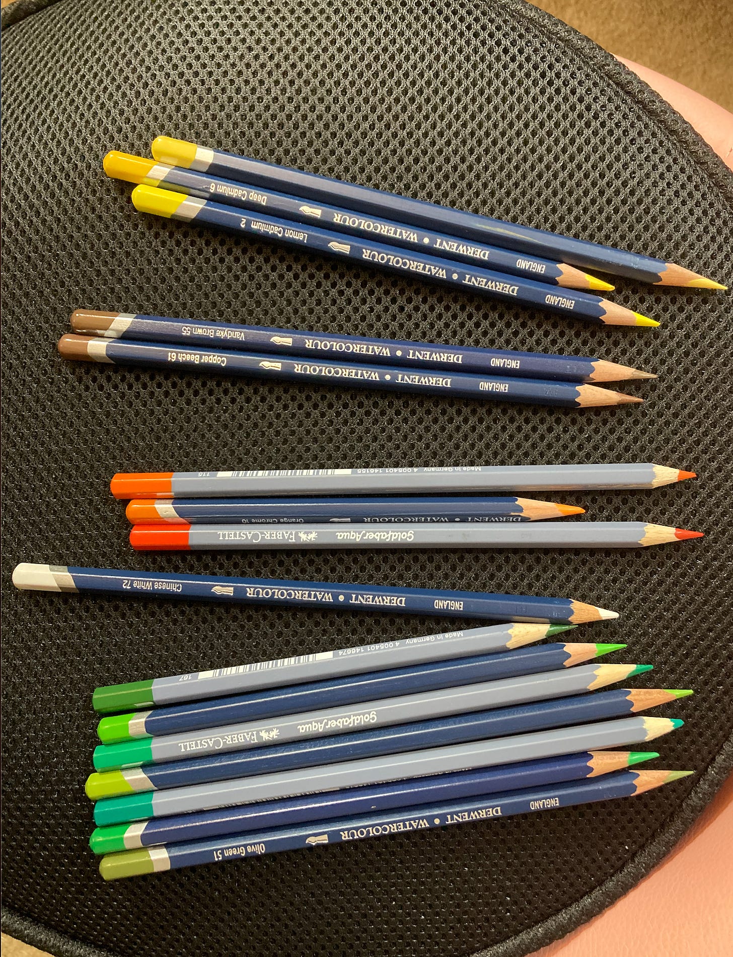
I have a full set of watercolor pencils, with many shades of yellow, orange, green, brown, and the other colors in this photo. If I just randomly choose as I go, the final picture will be haphazard. I will choose my palette ahead of time and sharpen them, putting the rest in a drawer. If I decide I need them later, fine, but that’ll be in the final stages. These are what I will use in the beginning layers. The white is for the lines of the veins in the leaves. I will try drawing the veins in white and then laying in green on top of them. This works very well in regular colored pencils, and I want to experiment and see if it will work in watercolor. Watercolor is so forgiving that if it doesn’t work, I can just use the white to put the veins in after it dries, so this is a low-risk experiment.
What I love about this part of the process is that it feels a little dangerous. I’m very good in graphite now — good enough to require almost nothing in the way of conscious thought around a palette.
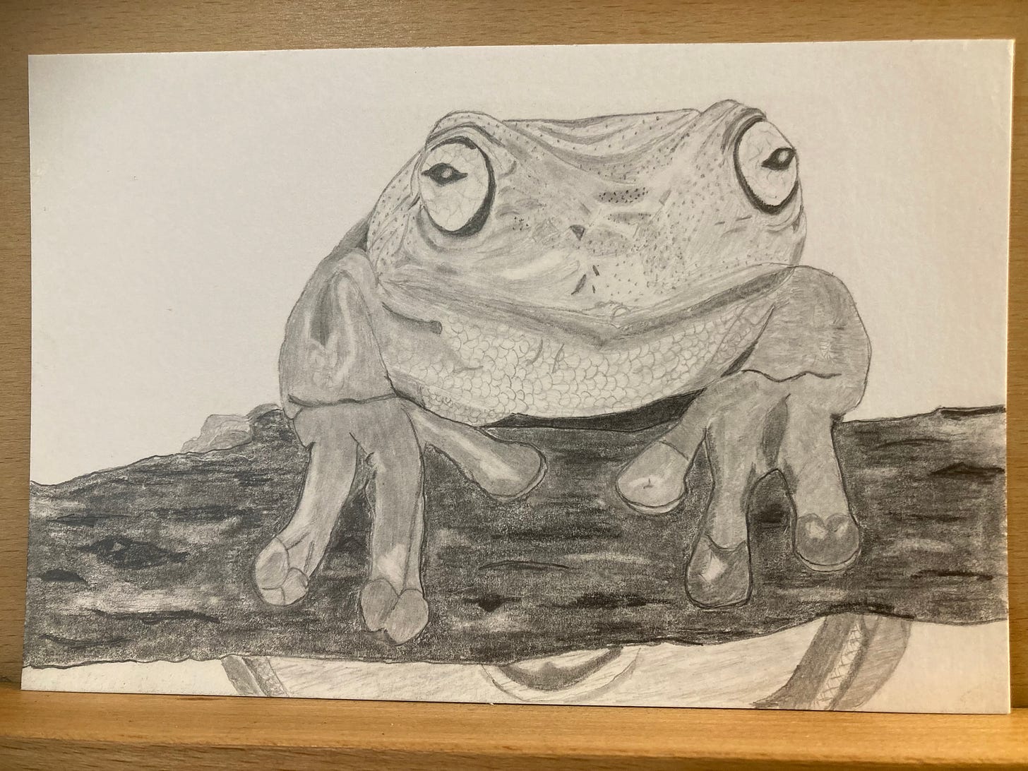
For example, I did both of these drawings in the same mental/psychological state:
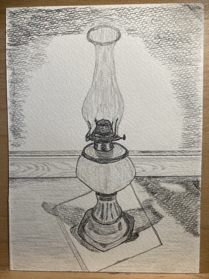
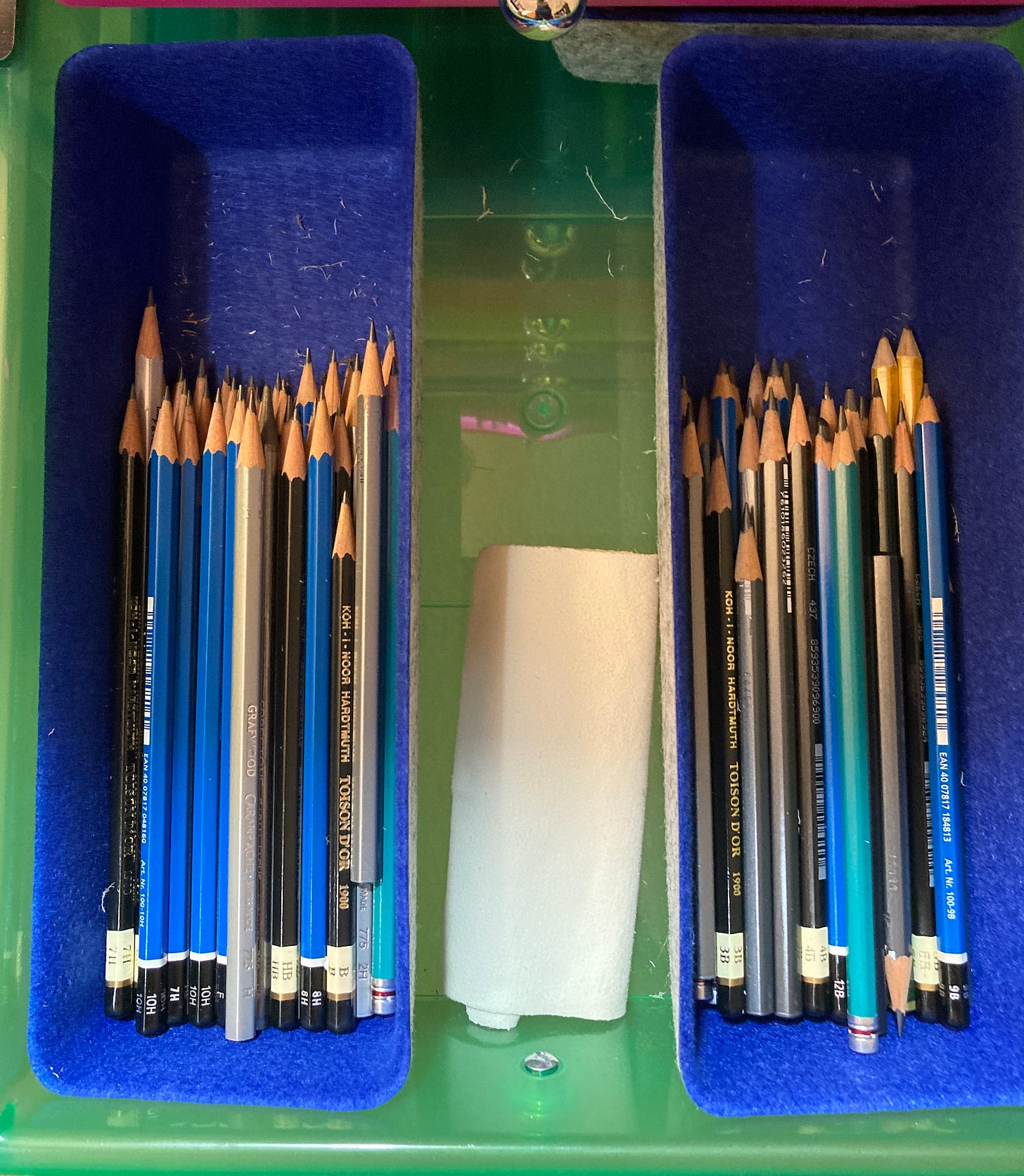
They were sent as postcards, little “thinking of you” gifts for friends who have special love for frogs and kerosene lamps. I did both of them in a state of blissfully mindful presence, fully absorbed in the drawing. My rolling organizer of art supplies is to the right of my drawing table, and I put the eraser/blender drawer several spots above the graphite pencil drawer so I could have them both open at once:
With graphite, most of the time I can just go on autopilot, choosing the correct pencil instinctively as I go. The lighter pencils — 10H up to F — in the bucket on the left in the picture; the darker pencils — HB down to 12B — in the bucket on the right. The only exception is a very large, very complex drawing that takes thirty-odd hours, in which case I make notes for what pencil I use for what part, so I can be consistent as I go. This is rare, though. Drawing in graphite is therapeutic and fun, and I am very busy. So I now tend to only take on very complex projects if someone is paying me for one.
But this instinct-driven process with graphite is after years of practice. With color, I’m still experiencing the half-thrilling, half-scary sense of not knowing what I’m doing. So choosing a palette is something I love for both the joy of it — oh my God, I’m actually doing color! and the sense of safety — if I screw it up, I’ll be able to reverse-engineer why.
The palette of colors I chose are a combination of pencils from a Derwent premium set I bought when I first started screwing around with color, before I started taking it seriously (high quality but not top of the line) and some single Faber-Castell pencils I got at an upper echelon artist’s supply store in Montpelier, Vermont. The latter are much higher quality and typically only sold (at least, that I’ve seen in person) one at a time, as the full set would be prohibitively expensive for most artists.
Step Eight: Start Applying Color
Now it’s time to take my kneaded eraser and shape it into a ball, then literally roll it around the page to lighten the outline until it’s barely visible, which will mean that the process of laying down color takes maximum advantage of the whiteness of the page.
I roll it around the page until I’ve erased as much of the guidelines as I think I can bear to lose but still see what I’m doing. I love that part because it feels like a game, which of course it is.
Now I will do the first layer of color. The very tricky part will be the middle of the sunflower, so I will leave that for last, as I need to think about it some more. I will put down a base yellow on the petals and a mixture of several greens on all the leaves. I know how some of the greens look once watercolor is applied, and I think some of the greens I have, mixed together, will come close to the right shade.
I will keep the stem a single shade of green, to maximize the contrast between it and the others, and the leaf that has the most influence from sunlight will also be a single shade. The rest will be a mixture of greens of varying proportions, which I hope will let me maximize interest and minimize uniformity while still looking like they all come from the same plant.
In this picture, the first pass is done. This looks nowhere near as nice as the final product will, which is one of the really fun parts of watercolor pencil—the astonishing contrast between the midway points and the end. I love the sense of mischief in knowing that it’ll get better and better as I go.
Step Nine: Walk Away For Awhile
It is very easy to mess up a color drawing by getting in a hurry. The first layer needs to settle and I need to clear my mind of the drawing before deciding on blending techniques and how many layers it probably needs.
What I love about this part is that it reminds me I have gained a lot of skill and patience. I waited close to two decades for the freedom and opportunity to teach myself to draw, and I got there. I did it. I can draw now.
Step Ten: Blend, then Apply the Rest of the Color
Having let it rest for most of a day, and even covered it on my drawing table so I wouldn’t accidentally see it, now I understand the next step and am ready to blend.
I’m going to blend using a Finesse color blender, a fun tool that I like a lot because it has a thin end for fine details and a thicker end for bigger sections.
This is after the first pass of blending the baseline colors in each and before deciding on the needed colors to continue.
It’s apparent that my mixing of several greens is not turning out as well as I hoped and also that the white lines didn’t work to create the veins in the leaves I hoped for, but this is not a problem.
I will pick a green I want to be the main shade, and lay multiple layers on top of this base layer. I’m going to leave the leaf most in the sun alone, as well as the stem, but go intense green on top of the mixed green areas. With any luck, that should turn out pretty well, with the mixture of several greens underneath the final shade choice making the leaves look more varied and interesting.
I love this part of the process because my self-defeating perfectionism can be circumvented. It’s not perfect and it will never be close to perfect — at least, not until I have years more practice. (I occasionally get a graphite rendering I consider near-perfect, but color is still a mostly-undiscovered country.)
After one layer of the chosen green on top:
After two:
I’ll add another layer of green to these leaves as I go, but now it’s time to use different shades of yellow to create the shadow effect in the reference photo, as well as the tricky center of the sunflower. I think I’m going to use brown for the outer part and green and brown both in the middle, with yellow highlights.
The next few pictures show that process at various stages, stopping when I’m ready to add the water. I love the way it gets closer and closer to the final product as I go.
Next I use a different shade of yellow for the parts of the petals that will be in shadow. Also, I decide on olive green for the part of the center that’s not in heavy shadow.
But I quickly realize I’ve done too thick/heavy of a perimeter for the olive green part, so I use my electric eraser to lighten it. The electric eraser works perfectly, leaving a white page behind, for graphite pencils, but for color media is a lot less effective.
This isn’t a huge big deal, as I can just add olive green atop the perimeter in a controlled scribbling motion of little circles. I do that, using two shades of green only for the part of it in the deep shadow, and add brown with a little bit of olive green and yellow highlights throughout the rest of the sunflower center.
Then I use the blender on the petals and the center of the sunflower, which helps start to give an idea of what the final picture will really look like.
Step Eleven: Add Water
I choose a variety of brushes. With a thorough cleaning between each, I could prevent unwanted color mixing, but that would take awhile and a mistake would be very costly. So I pick several different brushes — wider ones for larger areas, smaller ones for fine details.
I use a larger brush to do the main parts of the darker green leaves. I know there are techniques for using those to do the edges, but I’m not up to that level yet. If I were screwing around for my own edification, I might try it, but I don’t want to take that kind of risk this far into something I intend to give away. So I will use a small brush to do the fine details on the green leaves.
The water is used up fast, so I do this part standing at the sink with a trickle of water flowing. That way I can just keep re-wetting the brush and re-applying.
After the main part of the leaves is done:
After the detailed edges are done:
I like how the leaves have turned out lighter around the edges, as that fits what I’ve noticed in real leaves. That’s what I love about this part of it—it usually has at least one pleasant surprise, like this one.
Then I go through the same process on the yellow petals and the center of the sunflower, a wide brush for most of it and a fine detailed brush for the edges.
There’s too much graphite still too visible, but I think it’s actually okay. It’s not ideal, but it doesn’t detract as much as I would’ve guessed it would.
I could even convince myself it helps a little.
Looking at this, I see what I need to do after it dries.
Take the leaf that’s mostly in sunlight on the lower left and add one layer of the same green that the other leaves are, so that it’ll look more like those but still different. Do that, then add water.
Add veins in the leaves, for realism.
Fill in the white spots in the sunflower center with brown or olive green, respectively.
Add a small amount of light brown—lighter than the brown on the perimeter of the center of the sunflower—to the shadowed part of the green center, to make the shadow more obvious.
I feel like the green overpowers the petals a bit, so I will try re-doing the shadows on the petals in orange, to create a more varied color range in the petals and reduce the strong contrast between the darkness of the leaves and the brightness of the petals.
I will let it dry for awhile and do this part when it’s fully dry. If I am happy with it after that, I’ll mail it in the morning.
Step Twelve: Final Touch-Ups After Drying
What I love about this part is that it’s mostly done and I’m adding little flourishes, which reminds me that I really have achieved my childhood dream. I can draw now. I’m nobody’s idea of a master artist, and my stuff will likely never hang in a museum. But it’s so much fun, and so satisfying. I got good enough with graphite that people pay me to draw stuff, and now I’m on a similar journey of improvement with color.
I make the planned improvements in three rounds, walking away and clearing my mind of the drawing between rounds, trying to assess it clearly.
Round one: added the white lines for veins, the light brown for the shadow on the green center, filled in the white spaces everywhere with the appropriate colors, and started on a little orange for the shadows on the petals.
Round two: blended those changes with the blender, added a bit more orange, and added the layer of green to the less shadowed leaf.
Round three: add water to the less shadowed leaf, let it dry, then add the veins to it after it dries.
Added veins:
Step Thirteen: Add Fixer; It’s Done!
Fixatif is a spray that keeps the drawing from smearing or otherwise getting damaged. Most artists call it “fixer” because it’s meant to fix a piece in place as-is.
I would normally mail this in a tube, as I do most drawings (except for the ones on bristol, a hardened, cardboard-like paper) but I’m not experienced enough with doing watercolor on mixed media paper to be sure of this plan. The paper has been changed by the addition of water and the drying process, and I’m worried that putting it in a tube might warp it into a shape I don’t want. So I will mail it between two pieces of cardboard to keep it flat, just in case.
Assessing the final product: I see flaws, for sure. The orange works for a shadow better in some parts than others, and the green of the leaves is blotchier than I was going for. I’m not sure if that’s a consequence of the layers of mixed green shades underneath or my lack of skills with watercolor pencils at this point. Probably some of each.
But I also see parts of it that I like a lot. The placement is good, the proportions are accurate, and the overall effect is both cheerful and a little serious, which is how I felt while I was working on it. I was happily looking forward to making something nice to send to the
house, but simultaneously struggling against my disassociation and other stressors at the moment. Happy. And serious.This happens a lot; some level of my emotional state while I’m drawing finds its way into whatever I’m drawing, often in ways that surprise me.
What I love about this part is that I know joy awaits the recipients. When I send something to my friends, they always enjoy what I draw and, because they know me, recognize that a drawing is an act of love.
When I send something to someone I don’t really know but admire at a distance, like Andrew and his wife, I enjoy knowing that they will be getting something one-of-a-kind that they probably can’t do themselves.
I think they could, if they tried—almost everyone could learn to draw if they really tried—but few people have learned to draw very well, and so getting a drawing as a gift feels like something very special.
Conclusion
As I’ve already written a lot about the process of learning to draw, including some tips for how to teach yourself to draw (with specific resources), and a reflection on the spirituality of creativity, this was the only way I could think of to write about drawing for my series without getting too redundant.
If people seem to enjoy it, I’ll do another one at some point with a graphite drawing, which would be pretty different, I think, as I’m a lot better at graphite.
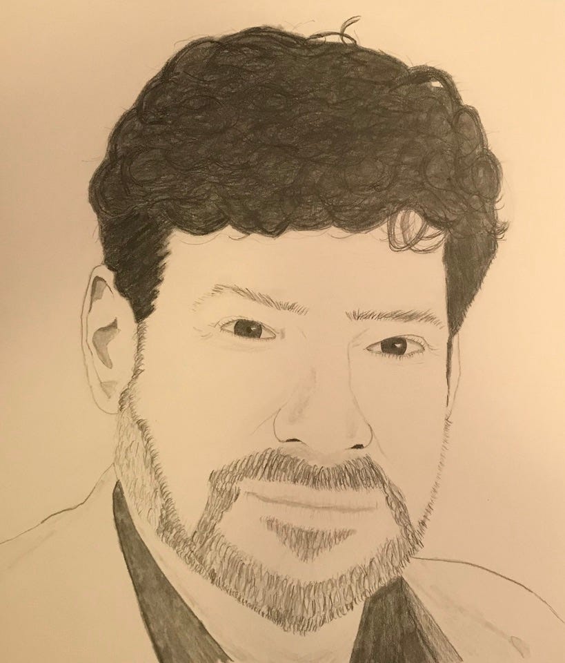
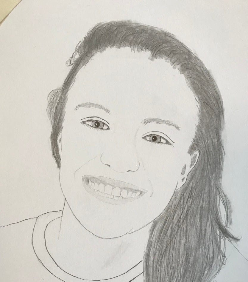
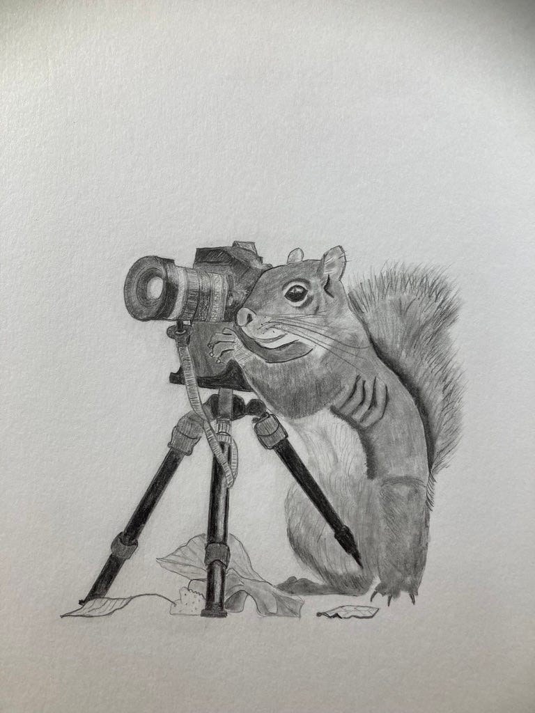
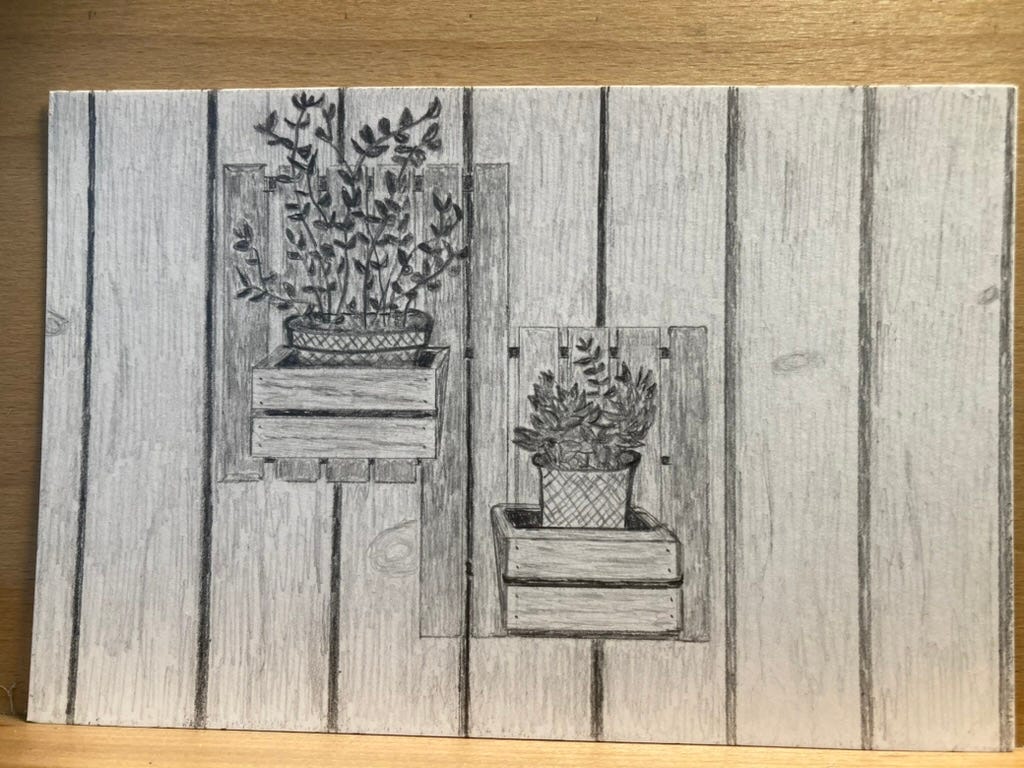
If you would be interested in a similar post for graphite, suggest a subject in the comments. I particularly enjoy faces, animals with human-made objects (AI can produce a decent reference image for most combinations) and things like mailboxes and planters. Anything with interesting angles and wood grain, which is one of the fine details I like best, is fun to draw. Here’s a couple of examples.
A piece like this fits broadly into the genre of “how to build it,” and it’s a surprisingly tricky type of writing to do.
This was a fun challenge both to draw and to write.
I hope it was enjoyable to read!


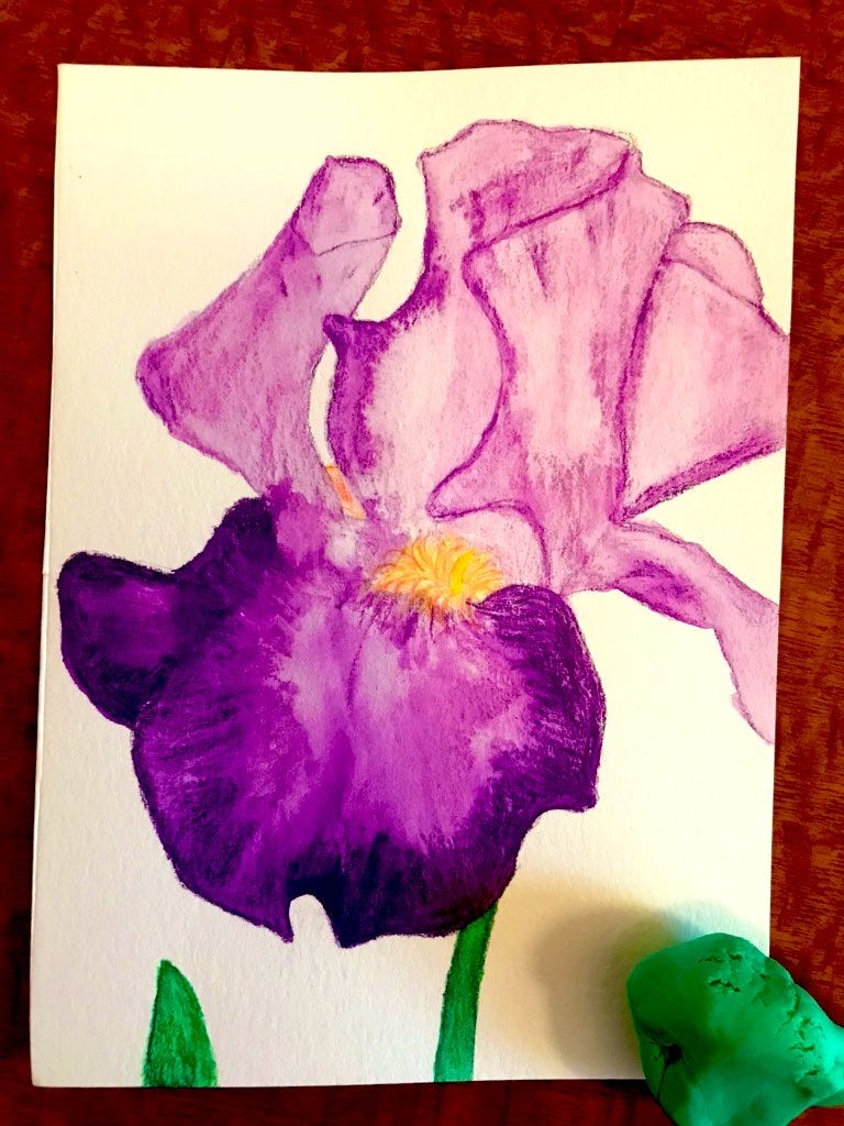
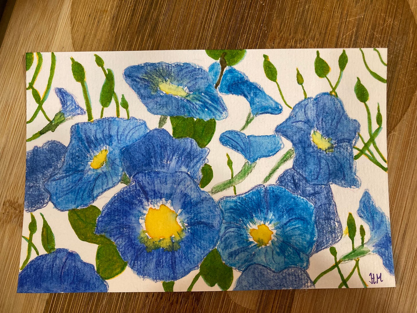
















I love this. Thank you!
That "postcard" of the oil lamp has pride of place in my writing nook. I just love it.
And anytime you feel like drawing irises and have extras, I'll take them:)